Income Inequality in the U.S.
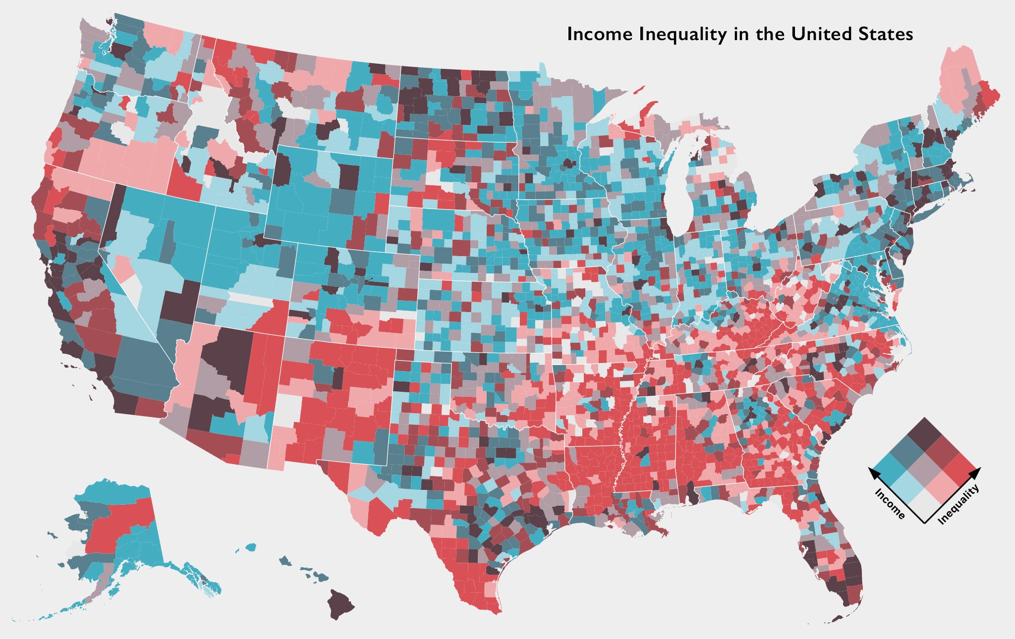
Mapping county-level median household income levels compared to income inequality (using the Gini coefficient) with American Community Survey data. This was another bit of playing around with Mike Bostock’s D3, this time with his Observable notebook on making bivariate choropleth maps.
Data: American Community Survey 2017 5-Year Estimate