AR Quick Look tracking in the snow? Not so much, unfortunately.
This is me testing out an early iteration of an idea to visualize lives lost to Covid with empty chairs. The 140 chairs in this field represent Pennsylvania’s 7-day rolling average of confirmed Covid deaths in recent days. (Next steps, besides testing again once the snow melts, include automating the building of the scene w/ Python on the server to reflect new data each day.)
The depth sensing hardware really struggles to track my position relative to the snow-covered ground. Sorry for all the camera shake, but you can see the AR scene shifting wildly as I trudge through the snow. Besides losing the magic of the augmented reality experience, without stable positioning it’s impossible to accurately scale and place the objects in the first place.
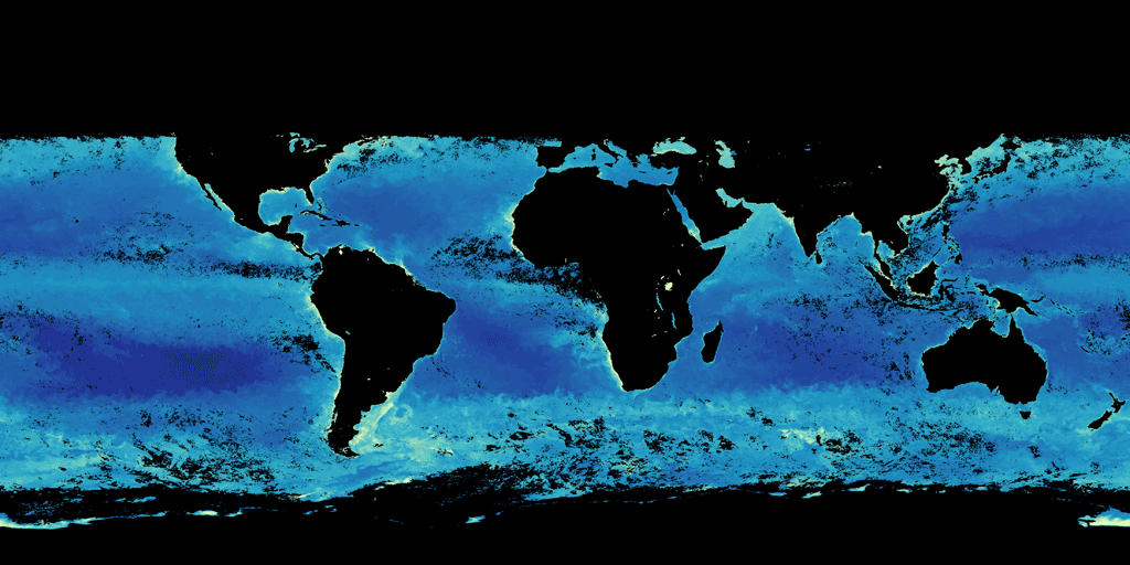
Animating chlorophyll levels in the world’s oceans throughout 2020. The presence of chlorophyll indicates where phytoplankton, and likely the animals that feed on them, are located.
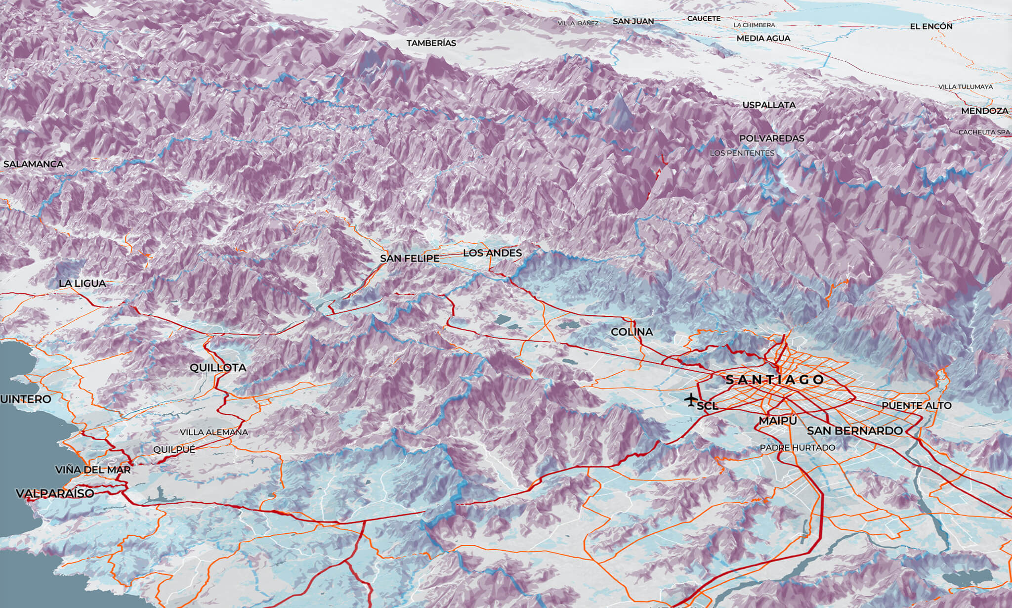
Revisiting my OK Computer Mapbox Style with 3D terrain. The purple hillshade with the blue park and forest land seems a little funky in 3D. Likely to come back to this palette again for a more serious style at some point!
Playing around with the updated satellite imagery and v2 of Mapbox’s GL JS.. This feels like taking a floatplane tour of the glacial meltwater near Wrangell, AK, complete with a bit of turbulence! (Caused by not setting the focus point to avoid “bumping” over the mountains, I presume.)
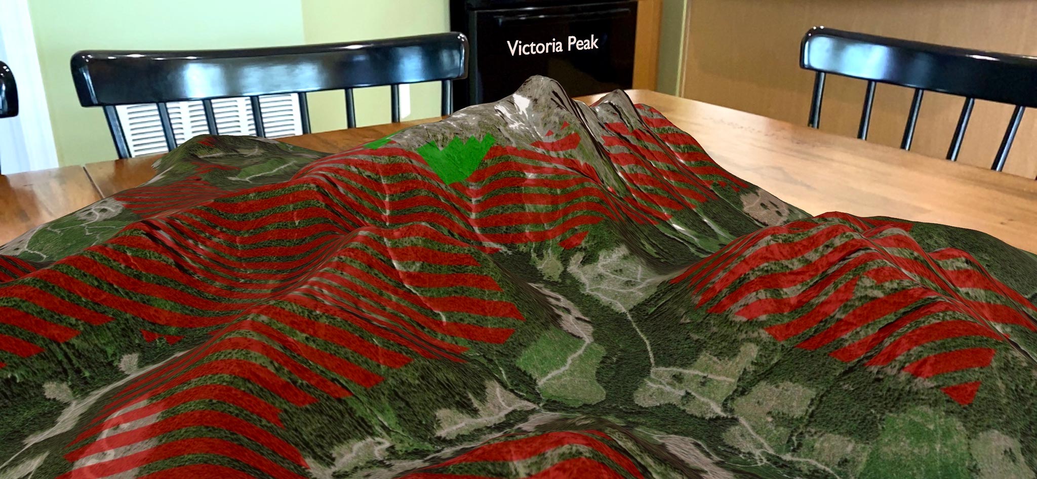
During NACIS 2020, I presented Using Augmented Reality to Communicate Climate Change Pressure on Vancouver Island Marmot Habitat, my capstone project for the Penn State Master of GIS program.
Below is a step-by-step guide to creating an augmented reality web map. Click on any of the screenshots for a larger view.
This guide uses QGIS, Blender and the BlenderGIS plugin, Photoshop, and Xcode on macOS. You could likely use ArcGIS or other GIS software, and replace the step in Photoshop with GDAL or other image manipulation software, for example. I am not aware of a substitute for Xcode, where we convert the scene to a mobile USDZ file, although one may certainly exist.
Prepare Your DEM
I’ve loaded a large digital elevation model into QGIS. I then created a polygon to use as a clipping mask, which will be the extent of the 3D model. I clip the DEM to my polygon and make sure to export that as a GeoTIFF with the same target coordinate reference system which I’ll use for all of my files.
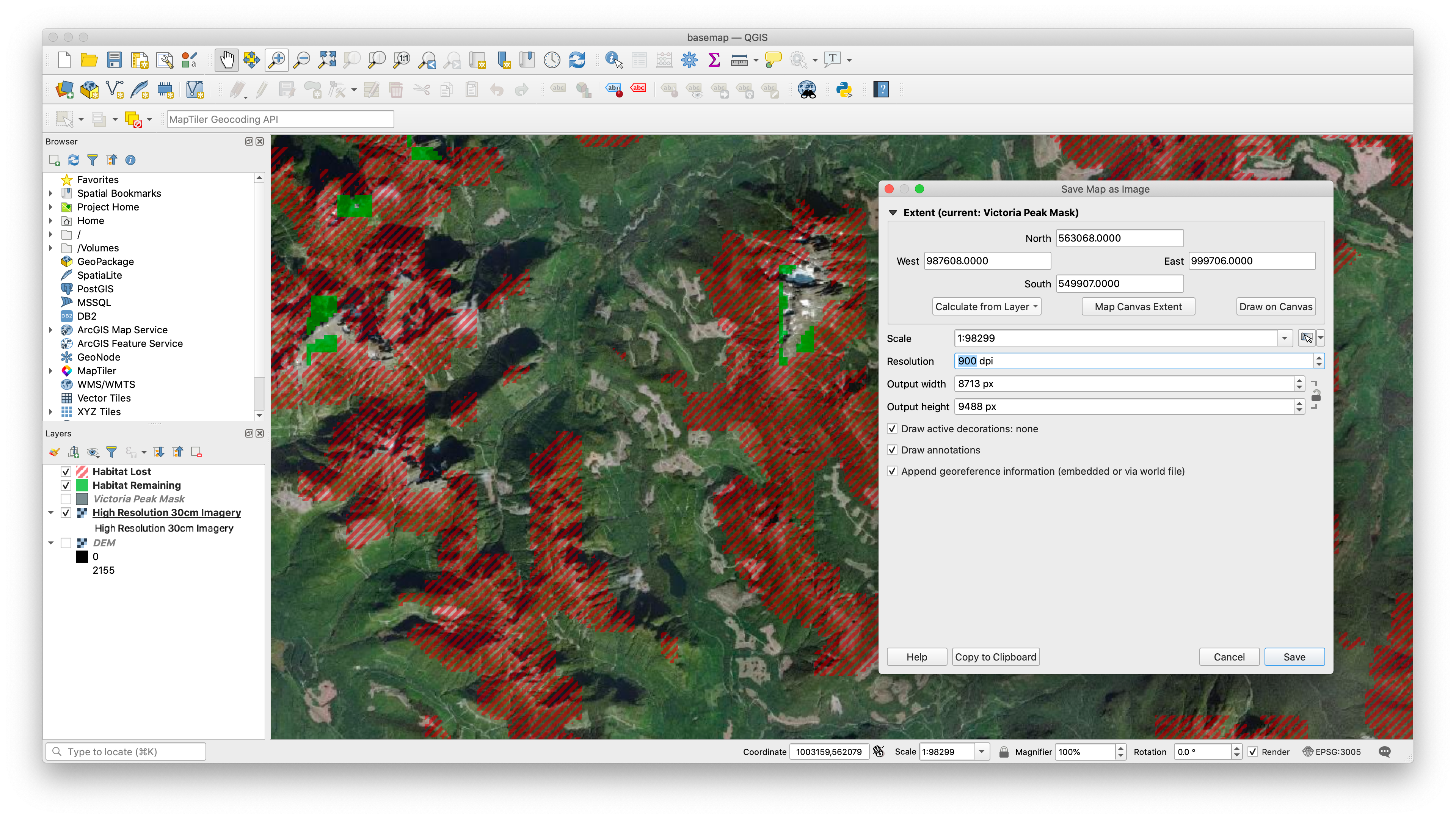
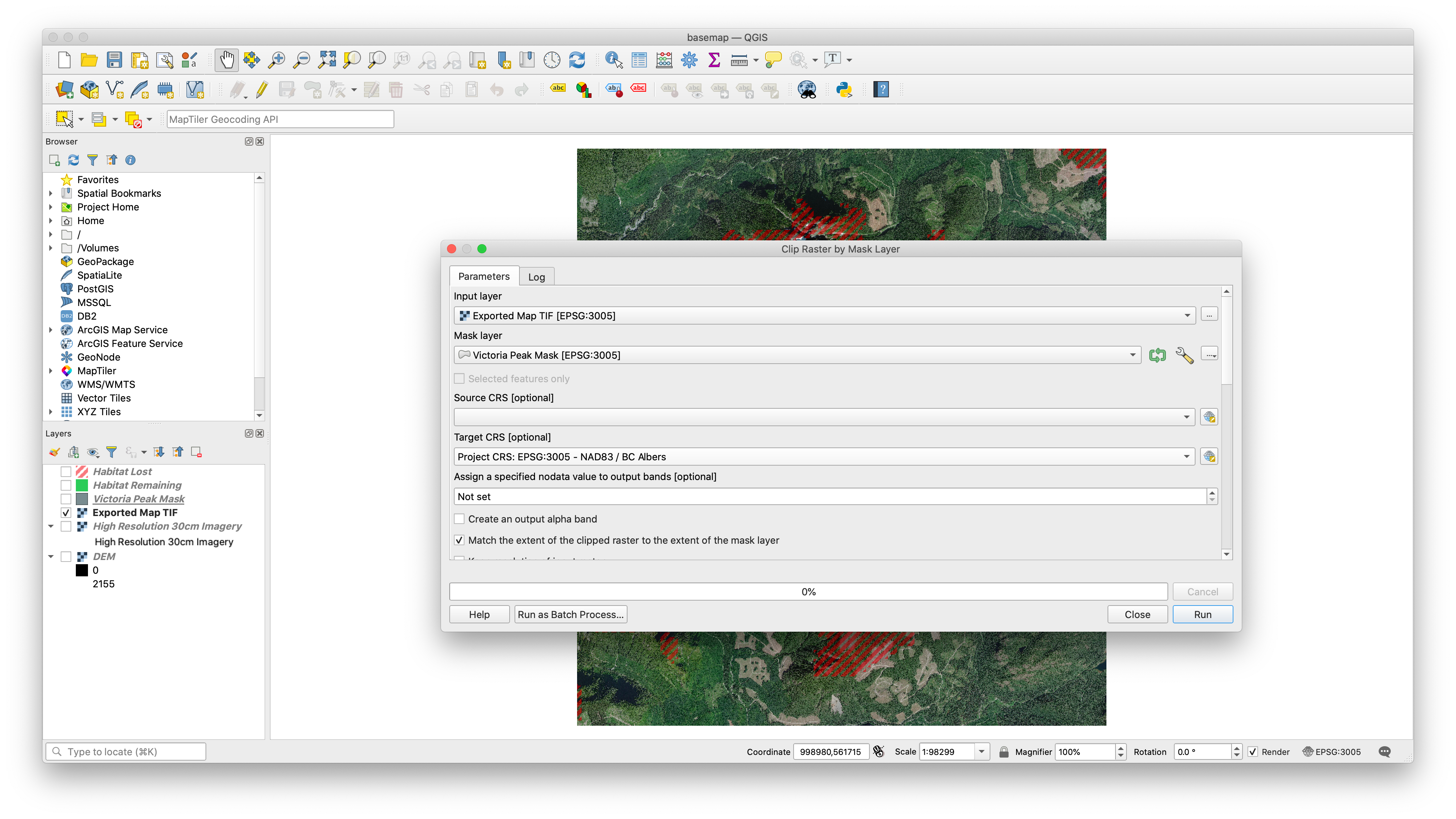
Prepare Your Map
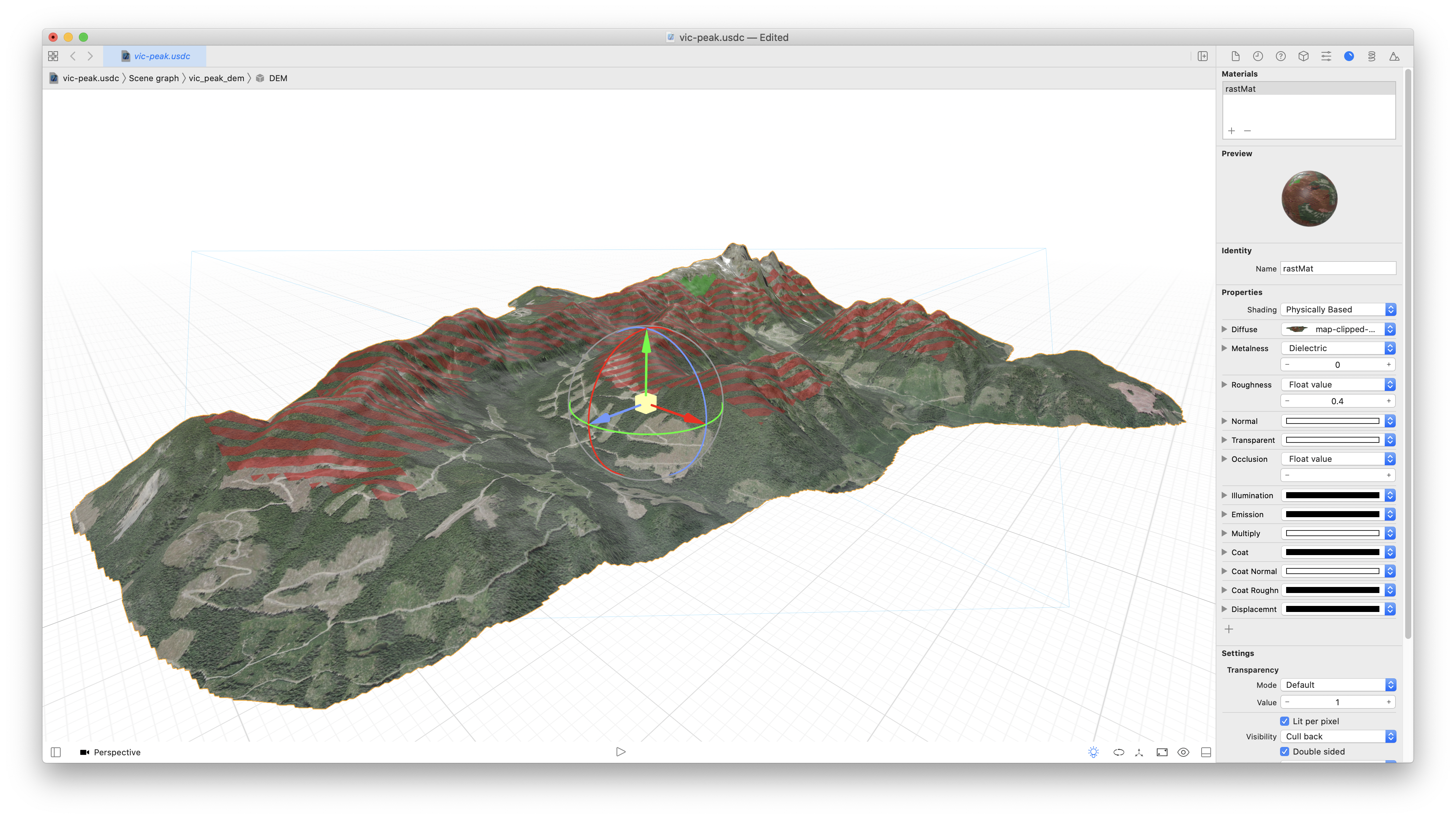
Next I need to save my map which will drape over the 3D model as a single GeoTIFF. You can see here I’m using satellite imagery as a basemap and have symbolized marmot habitat layers with some transparency, the habitat projected to be lost in a striped red and the remaining habitat in bright green. I used the mask layer as the extent and increased the resolution of the exported file to make sure there is plenty of detail in the imagery. This is a balancing act between file sizes and detail, of course.
Clip the Map TIFF
Because these GeoTIFF files are huge, I’m going to trim off any bit of extra that I can, clipping the newly exported map image by that same mask polygon.
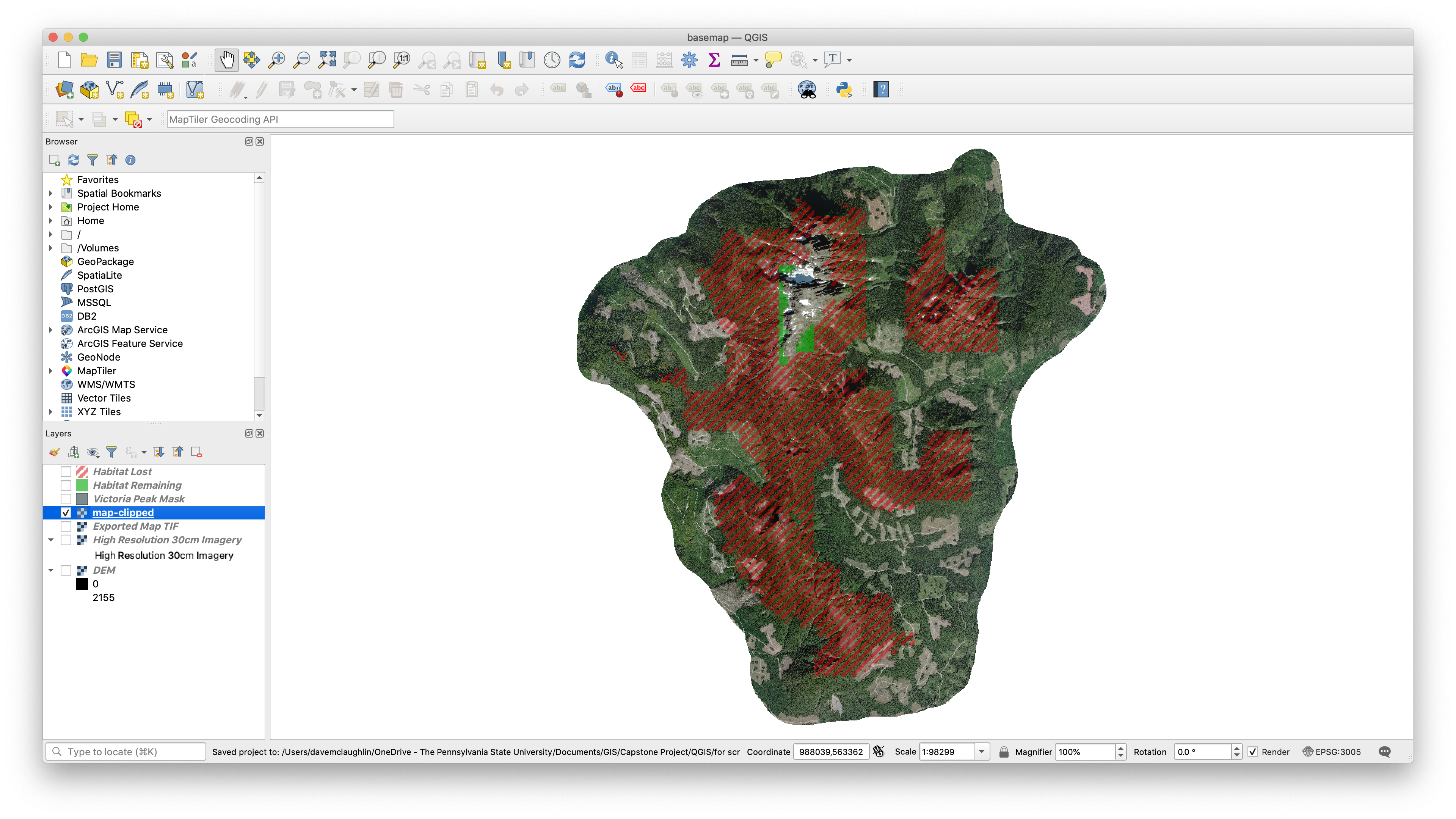
Two Clipped TIFFs
That leaves us with two clipped TIFs that we’re going to use to make the 3D model in the next step.
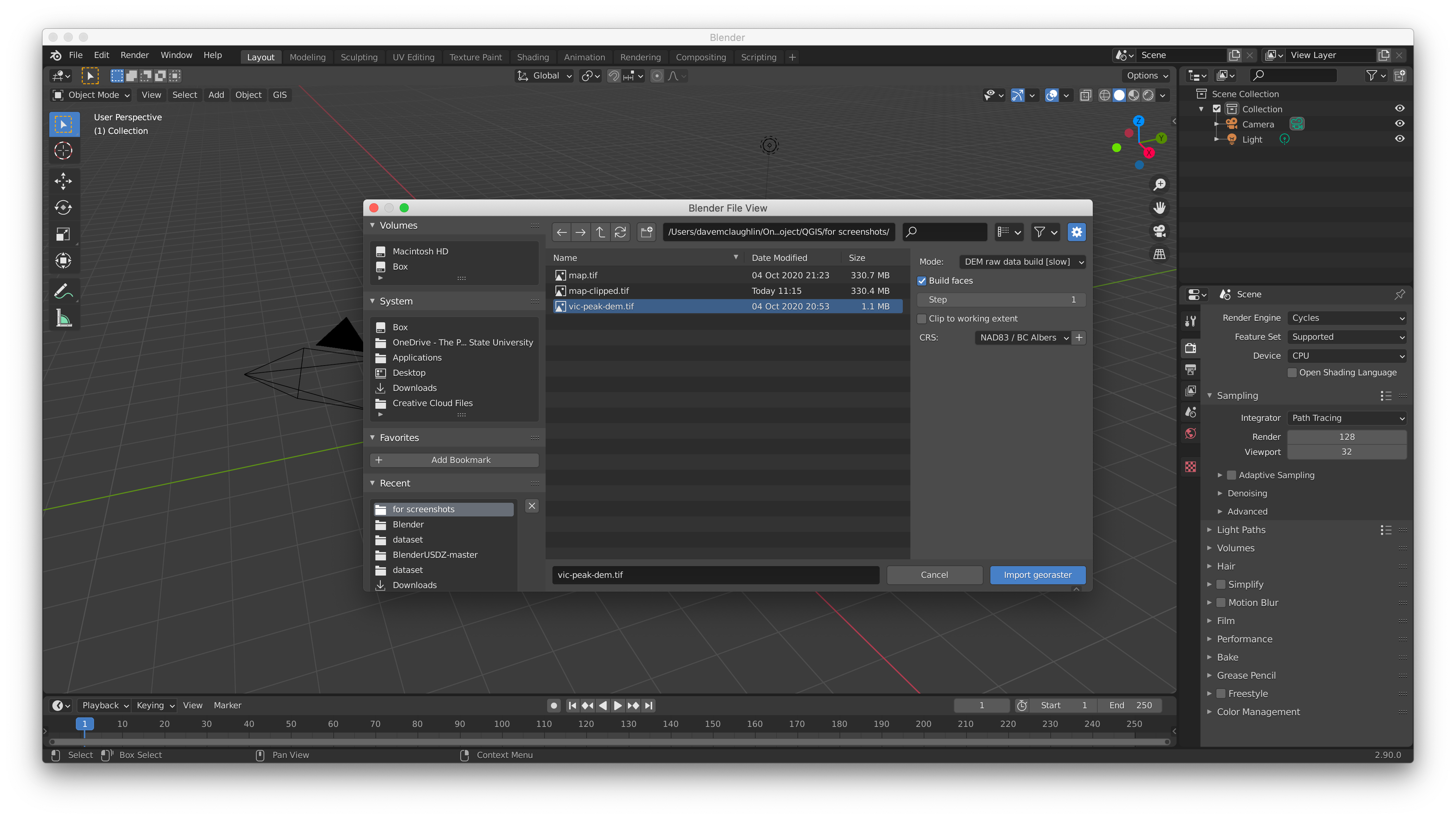
Importing into Blender with BlenderGIS
Now I move into Blender, a popular free and open source 3D modeling software. Key to making everything work, especially for someone new to working with geospatial data in 3D (like me), is the BlenderGIS plugin. Follow the BlenderGIS instructions to get it installed, and then you’re ready to go.
The first step in Blender is to use the BlenderGIS plugin (click the GIS button at the top left of the viewport) to import the DEM as a raw data build, which creates the 3D mesh.
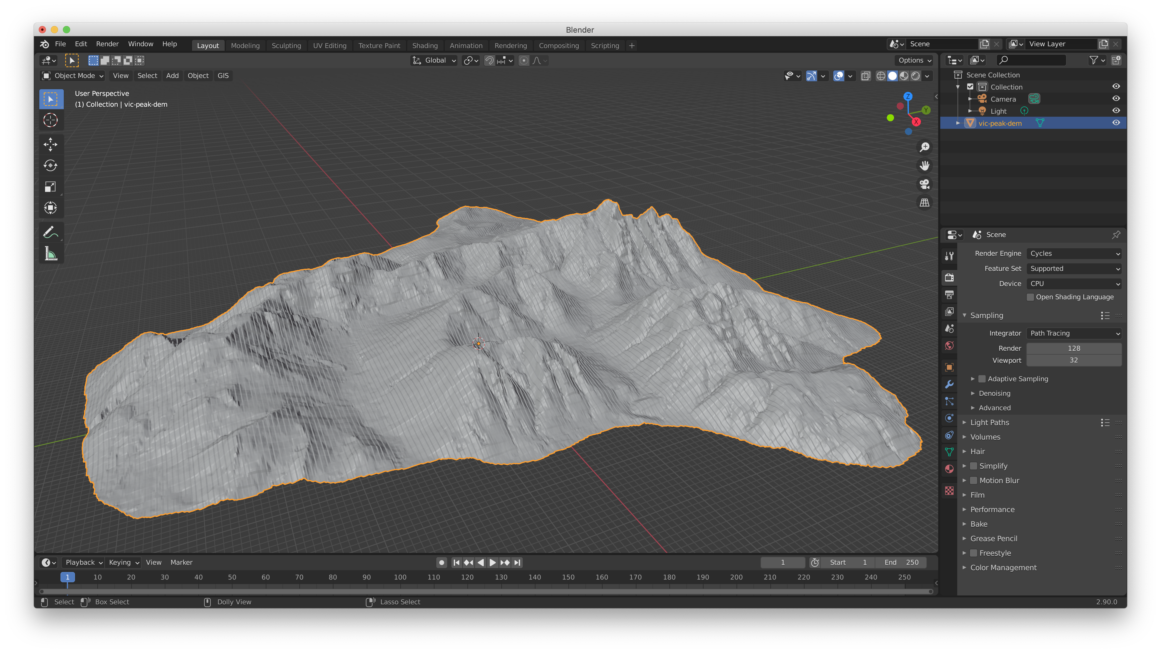
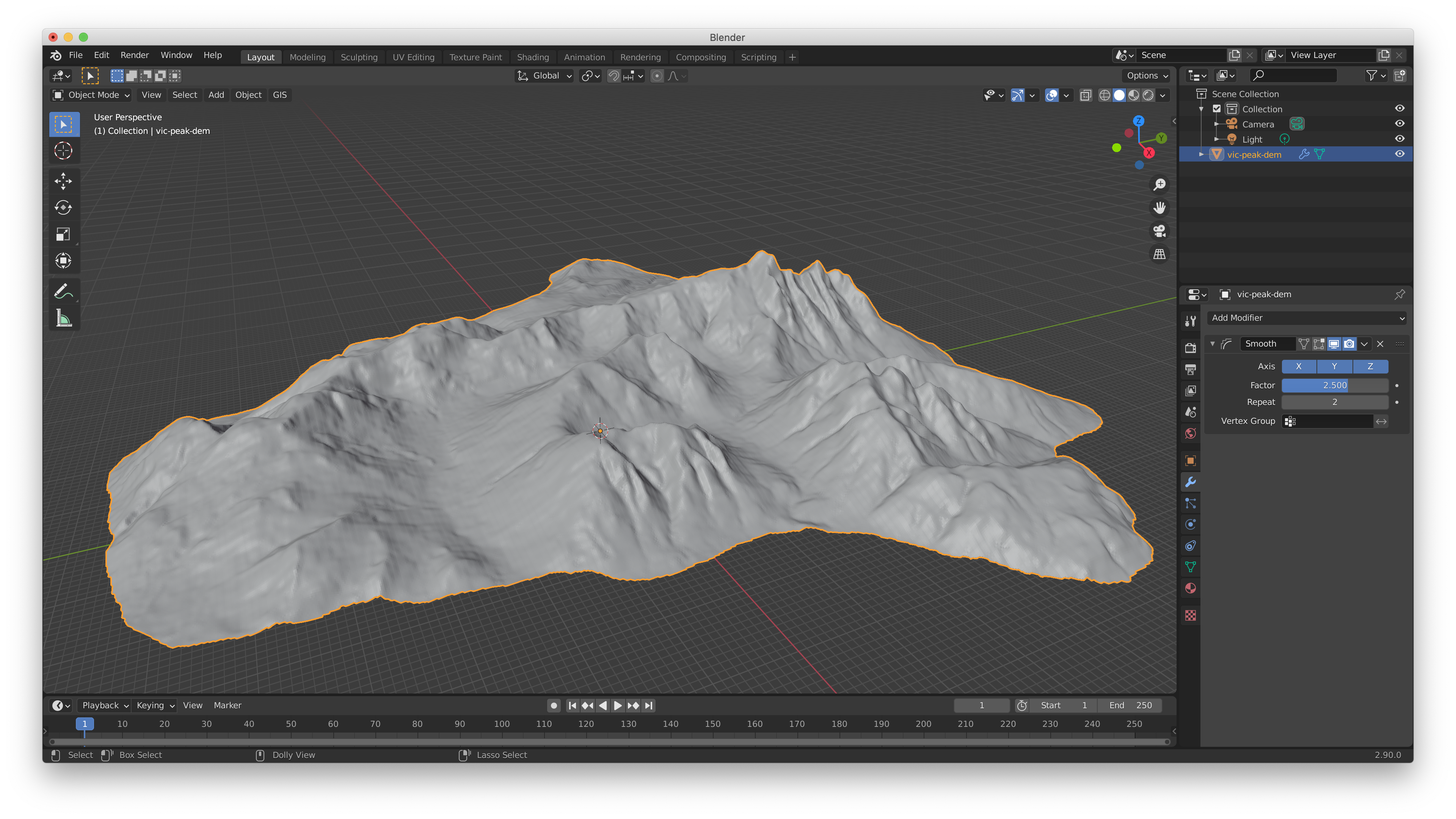
First Look at the Model
This can take a bit of time to process, but this is what you end up with. Depending on a number of factors, like the resolution of your DEM, the mesh might have some visible banding like you see here.
Smoothing
It’s probably a good idea to smooth the model at least a little. You could also choose to use the Decimate modifier (with the un-subdivide setting) at this step in the process to reduce the number of points in the mesh for big file size savings.
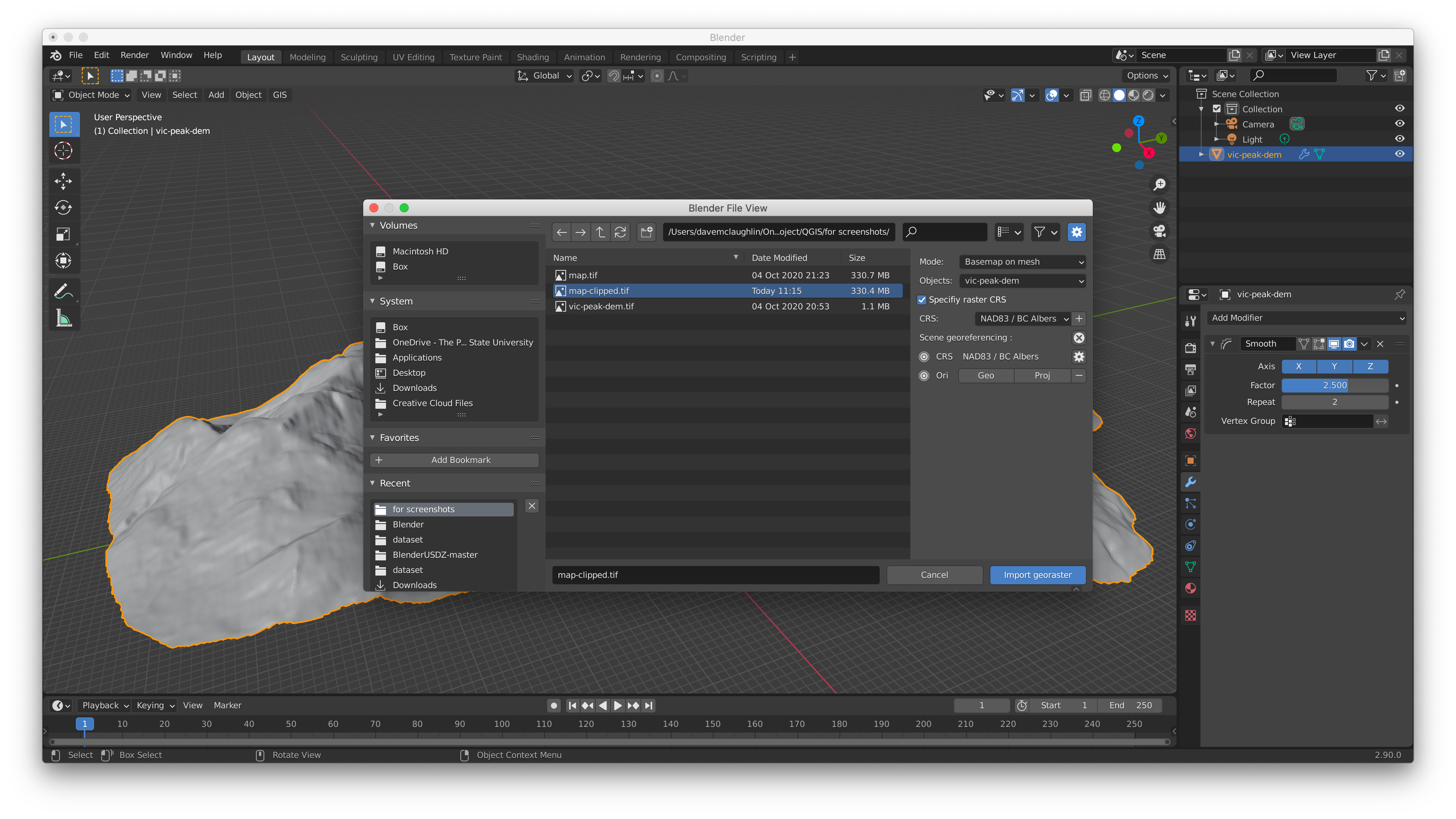
Importing Our Map onto the Model
Now that we have our 3D mesh ready to go, it’s time to import our map georaster on top of the mesh, again using the Blender GIS plugin.
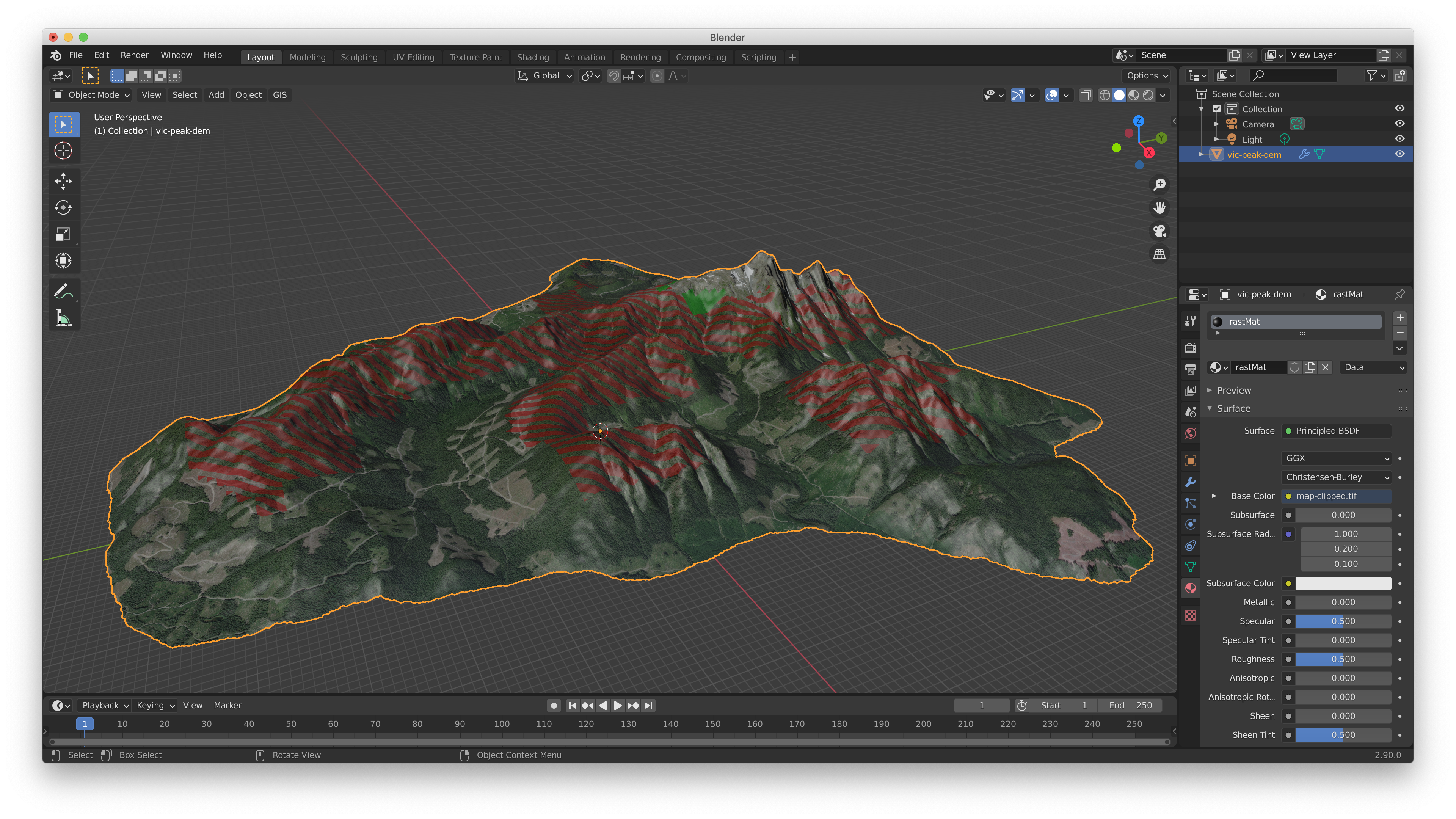
Imported Map
BlenderGIS uses the map as a custom material for the surface of the model and we’re getting closer to a finished product.
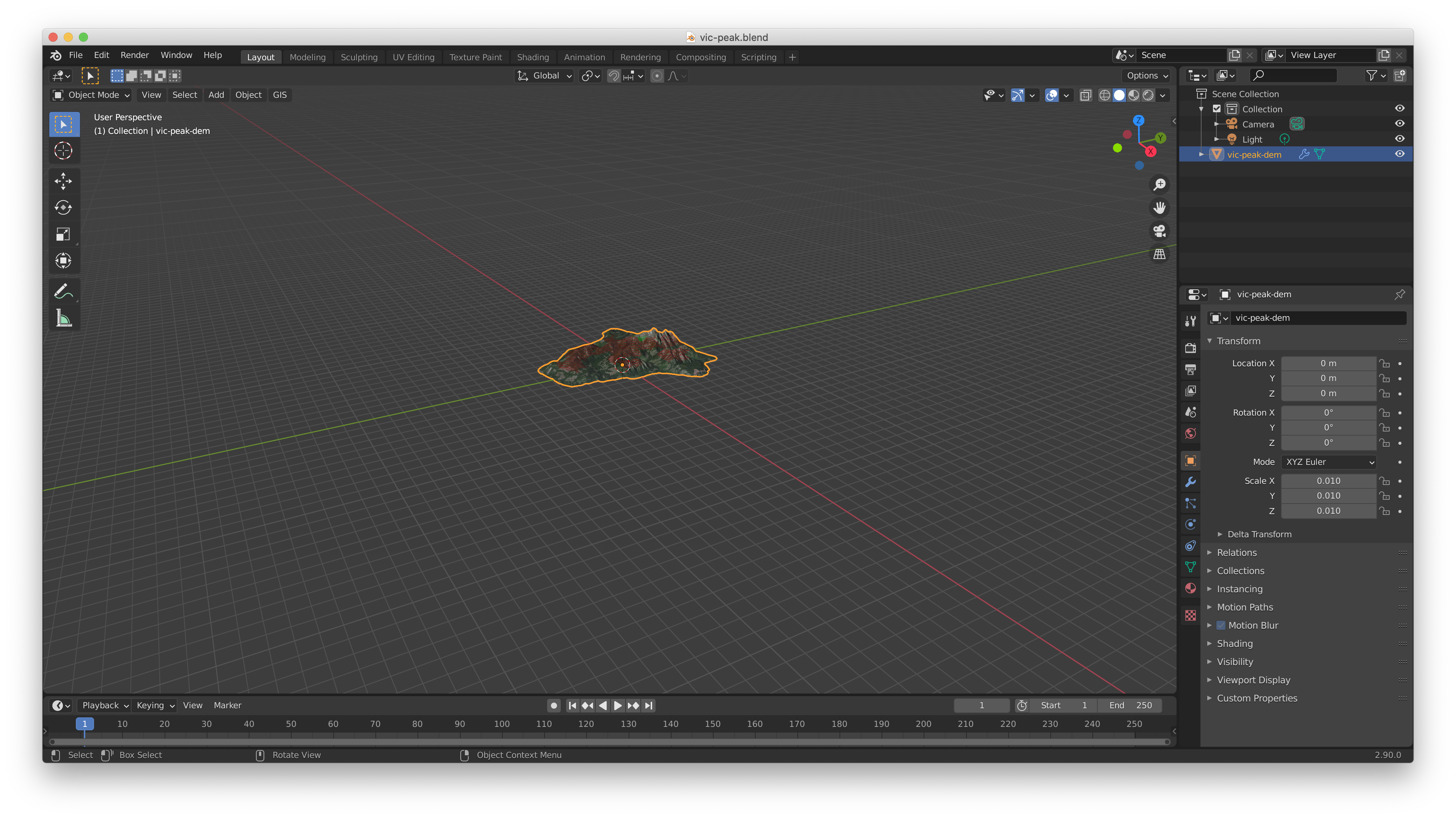
Scaling in Blender
My last step in Blender before exporting is to scale the model down a good bit, to get its dimensions relative to the real world more manageable for when we display this in AR. In this example I also do more scaling in Xcode, but liked the flexibility of breaking it into two steps so I could make fine adjustments later. Your mileage may vary!
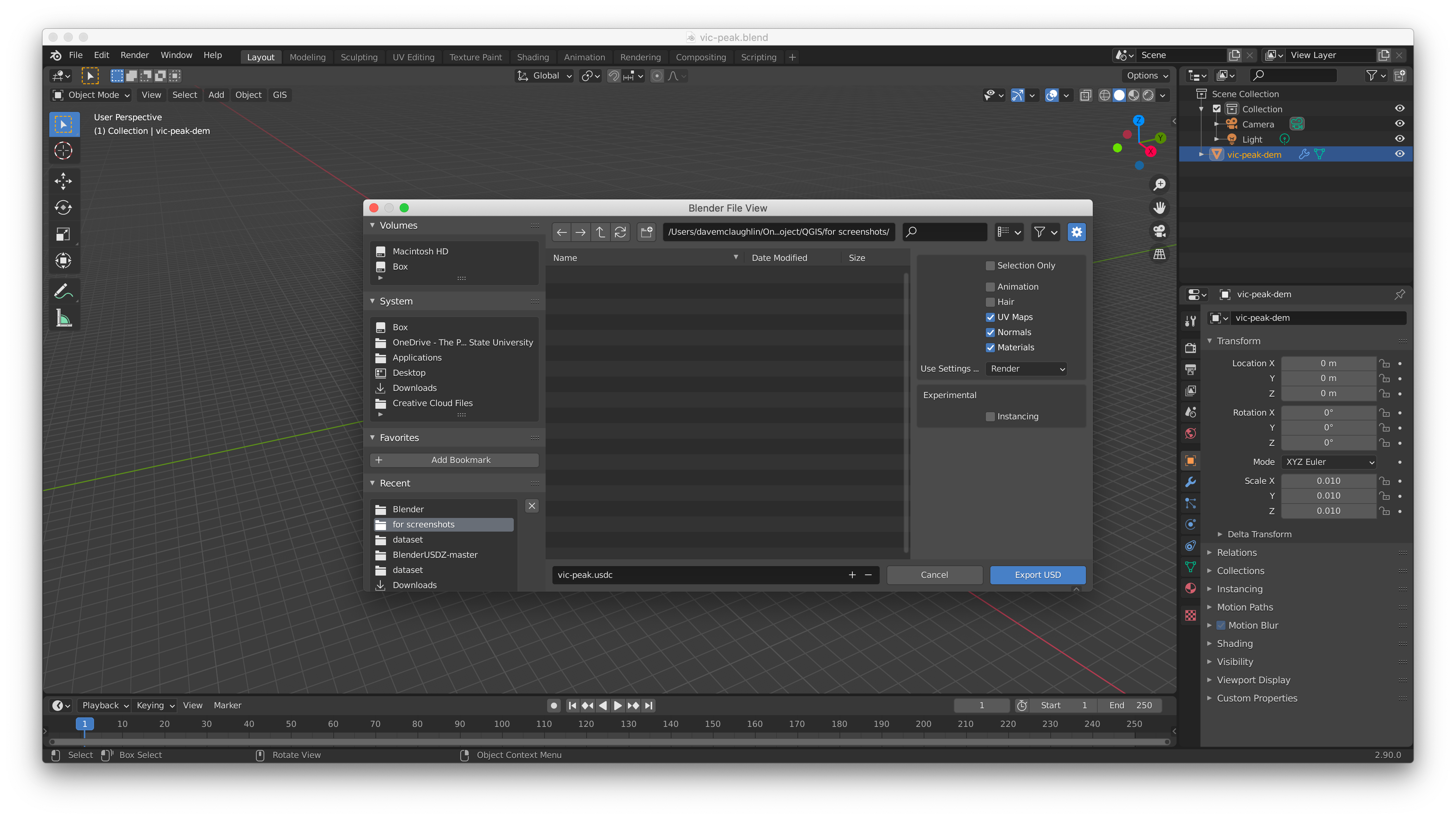
Exporting a USD from Blender
And now we export from Blender as a Universal Scene Description file so that we can move into Xcode.
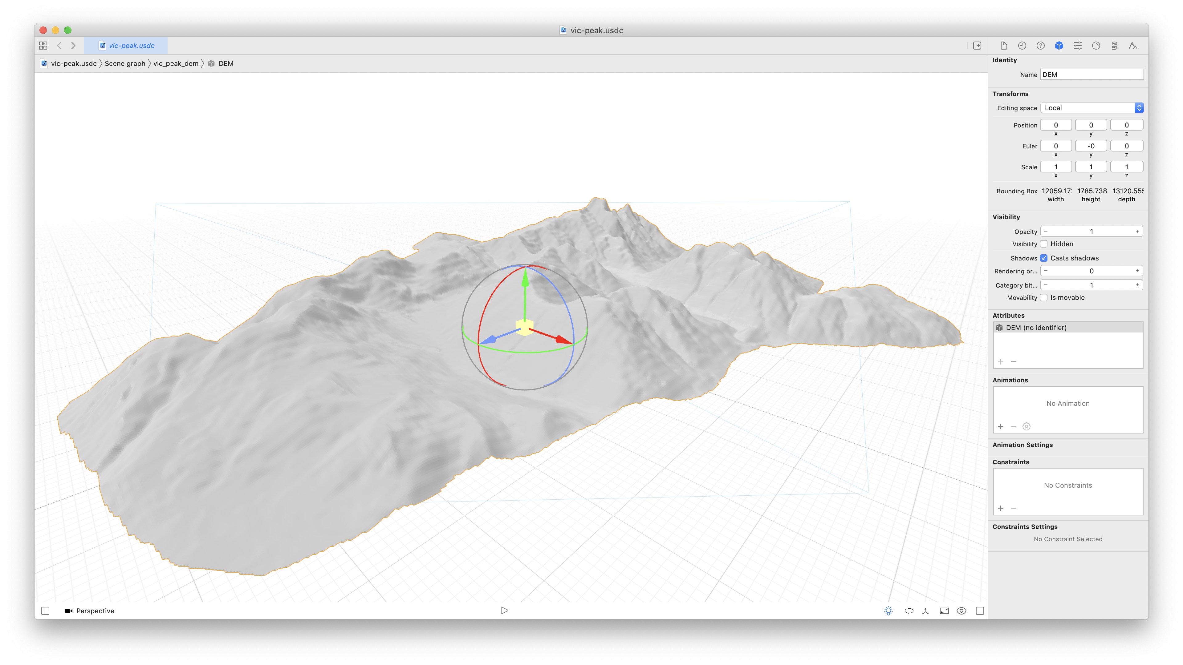
Opening in Xcode
The first thing you’ll notice in Xcode is that we seem to have lost our map, but that’s ok. We’re going to perform one more optimization on our map GeoTIFF before bringing it back onto the model.
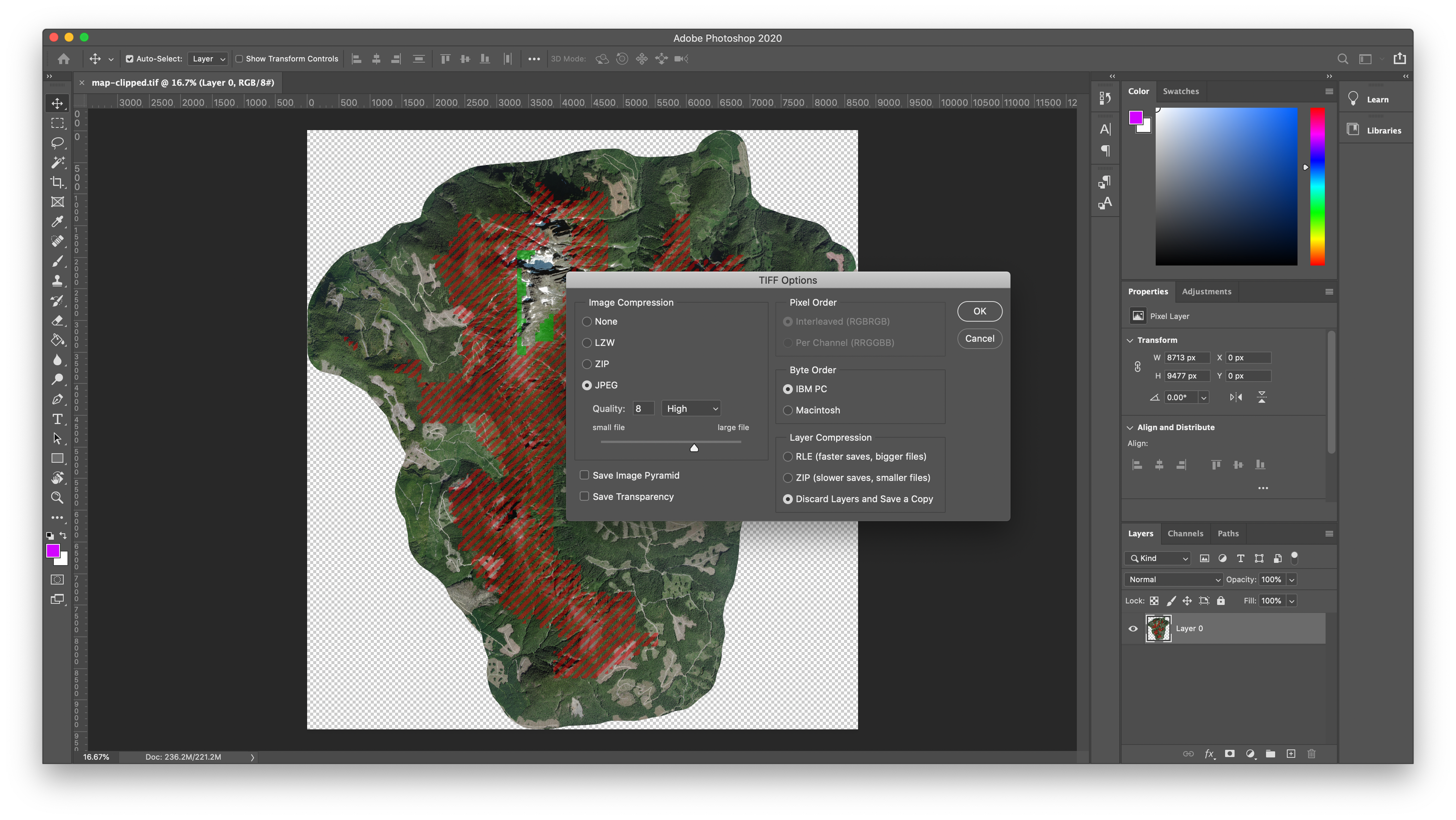
Optimizing with JPEG Compression
In Photoshop, GDAL, or any other software capable of working with TIFFs, open your clipped map file and resave it using JPEG compression. It’s important that you do this step at this point in the process and not earlier. I couldn’t get the BlenderGIS plugin to successfully read a GeoTIFF with JPEG compression, but we’ll be fine to bring it into Xcode since the model is already set up. We’re going after file savings here, since you may be wishing to share your model across the Internet. With this high-res satellite imagery, I’m able to maintain a high quality file while reducing the size from 330MB to 10MB.
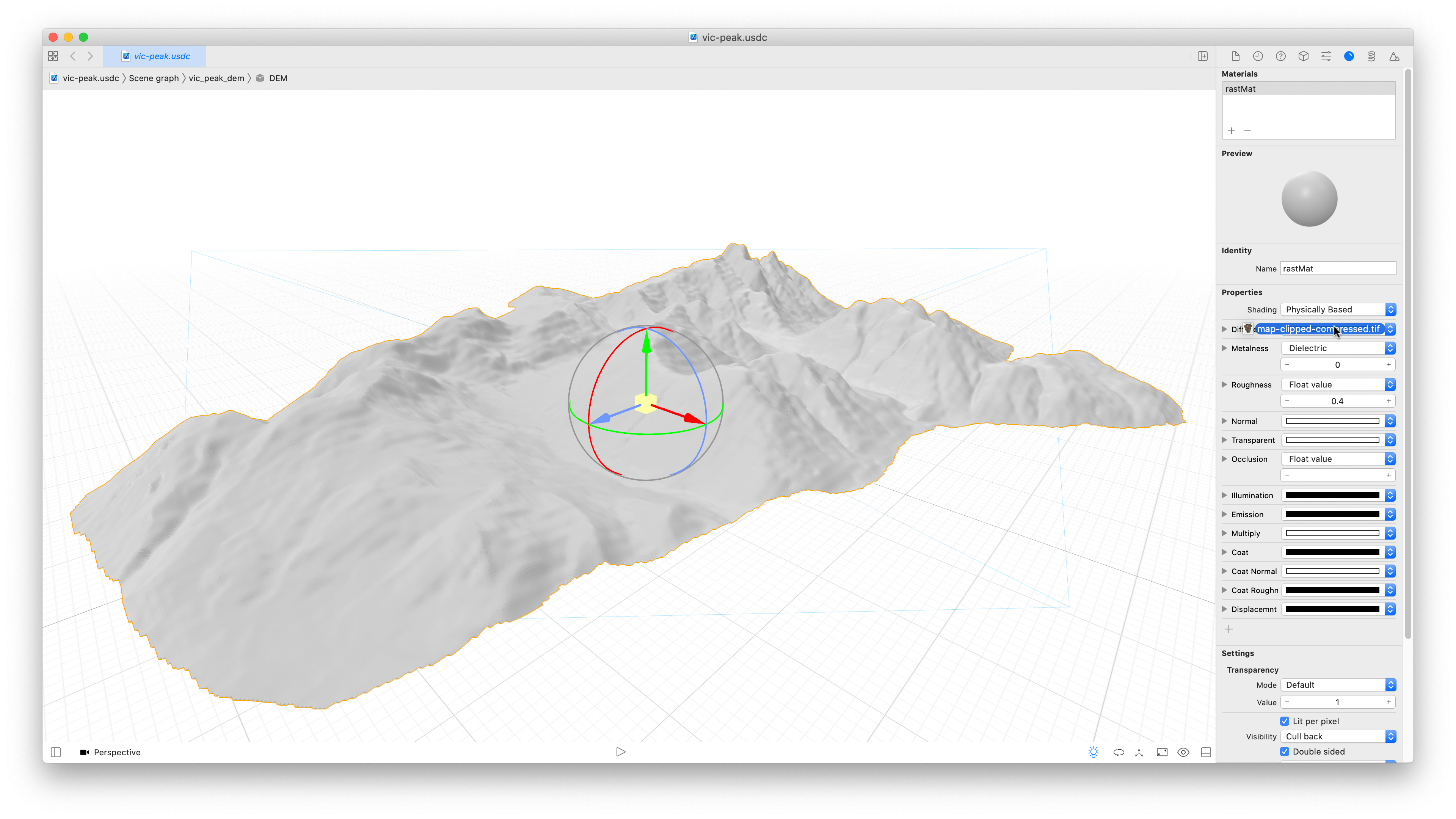
Re-Add the Map as the Material
Now we can jump back to Xcode, select our model, and flip to the Material inspector. From the Finder, drag your newly-compressed TIFF onto the object itself or onto the Diffuse setting, which is currently just a light gray swatch.
That’s Better
And now we have our optimized map back on the model.
Removing Reflections
Turn the material roughness all the way up to 1 to remove that shine from the model.
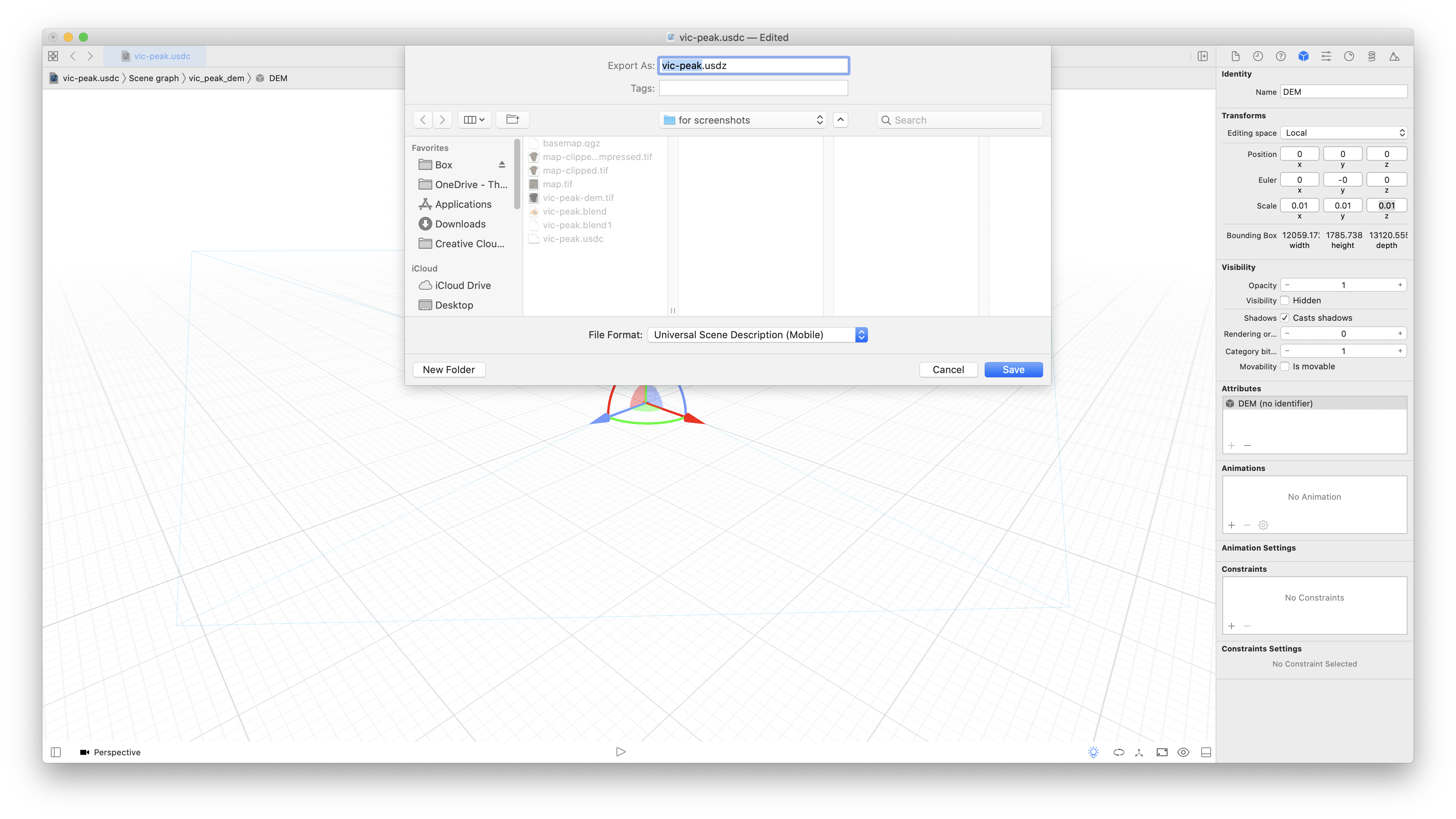
Final Scaling and Export
Update the scaling settings here in Xcode to reduce the size of the model again (trial and error to get a good size), and then export as Universal Scene Description Mobile to get the USDZ file that can displayed on mobile devices.
Optional: Embed the Map in a Website
At this point you should have a .usdz file which you can open in Xcode or the Preview app on a Mac, or from any app on an iOS device. You may want to embed it on a website, however. Here’s the HTML syntax to use:
<a href="vic-peak.usdz" rel="ar">
<img src="vic-peak.jpg" alt="A map of Victoria Peak, showing marmot habitat">
</a>
To break that down, we have an image (take a screenshot of your map!) wrapped in a link. The link points to the .usdz file and has a rel attribute of “ar” to help browsers identify what to do with it.
Video Demo
In the video below, I demo the model of Victoria Peak’s changing marmot habitat that I created in the screenshots of this step-by-step guide. Note that I also added a 3D text label for the mountain in Blender, which I didn’t include in the walkthrough.
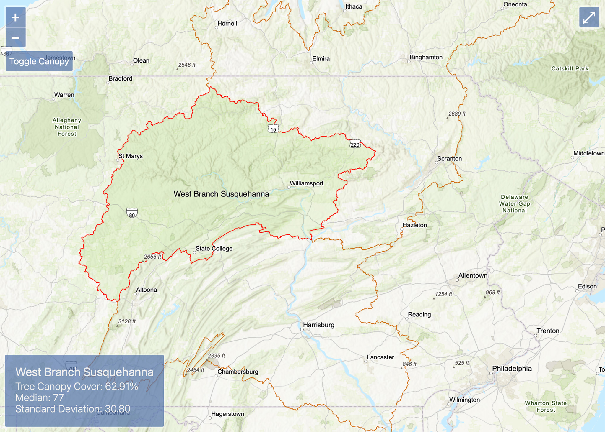
I was hoping to dynamically calculate the statistics on the fly using Esri’s ArcGIS API for Javascript, but it looks like the ability to perform some of the necessary raster functions was removed from the latest major version of the API. It looks like Esri is pushing folks to use the ArcGIS Server product instead and perform the calculations on the server, not in the client.
Instead, I pre-calculated the statistics in ArcGIS Pro and manipulated my files in QGIS and Mapshaper (to deal with the right-hand rule!). The map is built with OpenLayers and loads with an Esri basemap and hillshade. The user can toggle the USFS Tree Canopy Cover layer, which loads in from the MRLC Consortium. The watershed boundary polygons and statistics are loaded as static GeoJSON files. Zooming in and out and hovering over the watersheds at various levels provides statistics on the forest canopy cover.
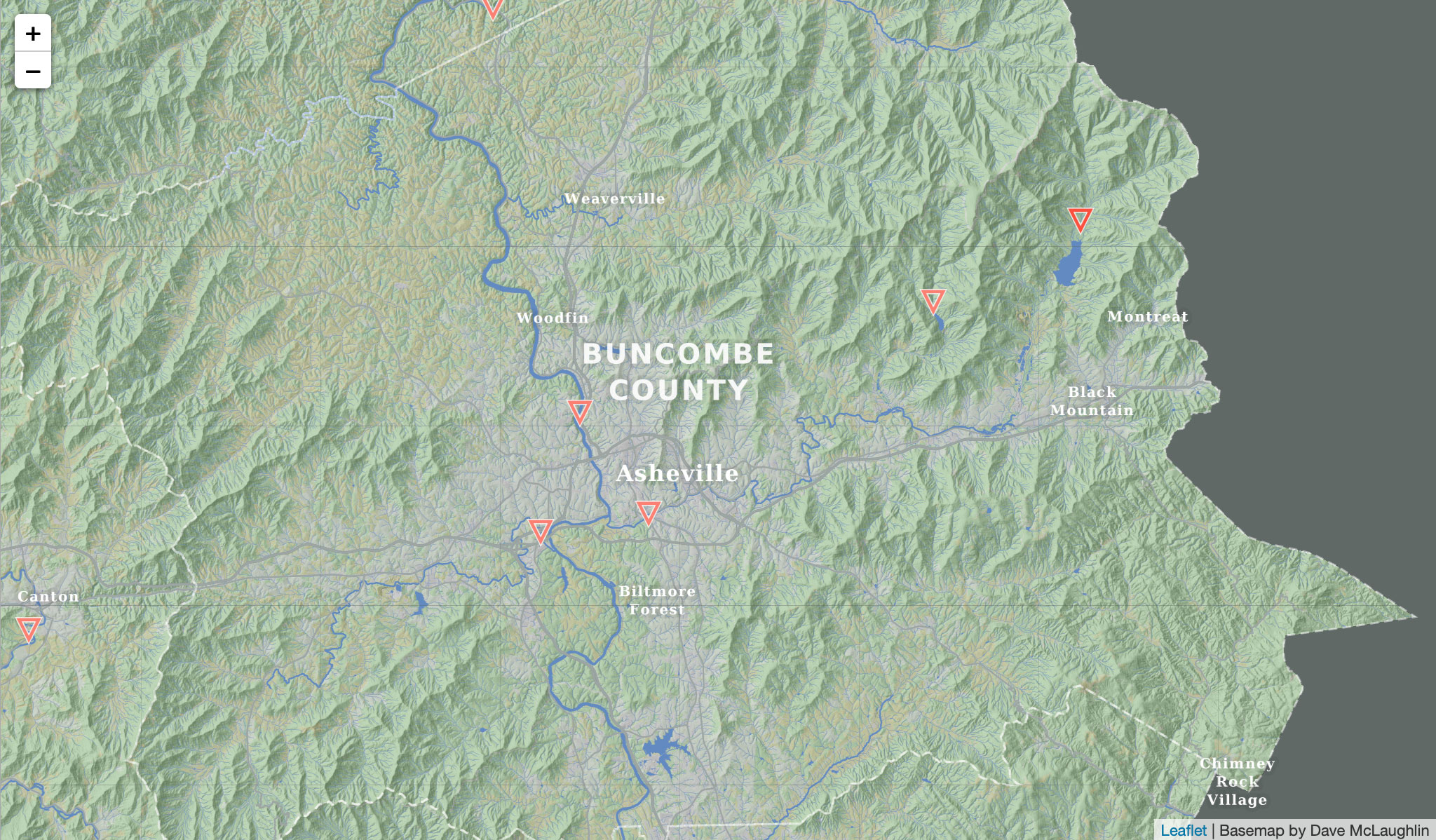
I created the custom basemap from scratch in QGIS, using data obtained through the USDA Natural Resources Conservation Service data gateway. I then pre-baked all the tiles using TileMill and use Leaflet to display the interactive map.
The feature layers (water level gauges) are hand-crafted, artisanal GeoJSON files. Clicking on a water gauge point on the map will then go make an API request to the USGS Water Service to retrieve live data on the water level at that point, which I then chart using D3.
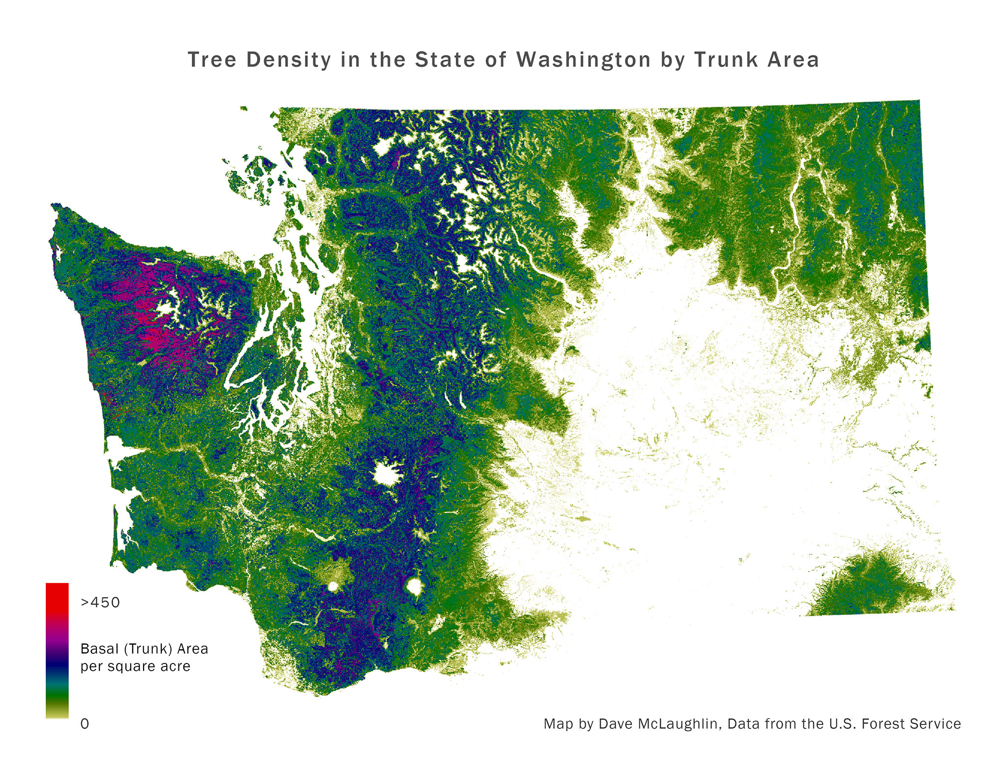
For an analysis grad course I used US Forest Service data to calculate tree density and tree “deficits” across Washington. Using ecoregions to compare like areas, I attempted to identify areas with tree densities much lower than the region could support, perhaps prioritizing locations for reforestation projects.
The analysis successfully pinpointed areas cleared by human activity and I produced 45 pages of maps and charts, if you care to dive in!
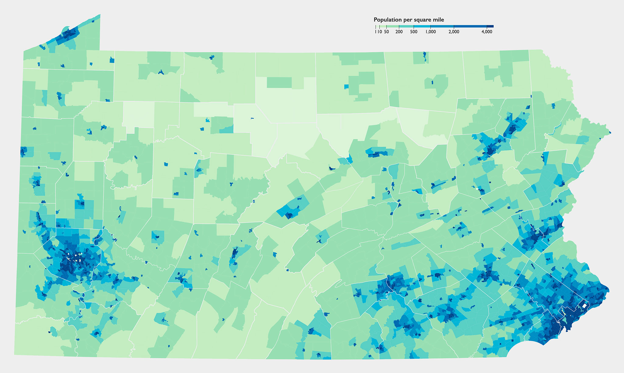
Built an interactive choropleth map of opioid overdose deaths in Pennsylvania in 2018, by county, using D3.js. The counties are shaded by the rate of overdose deaths, not the raw number.
Counties which experienced between one and nine deaths show no data, per PA Department of Health rules.
A companion photo to Forbidden Lake, this has been my desktop background for a year. Taken during one of the most magical moments I experienced on Vancouver Island last fall, this was from a slightly different vantage point along the lake in the Forbidden Plateau area of Strathcona Provincial Park.
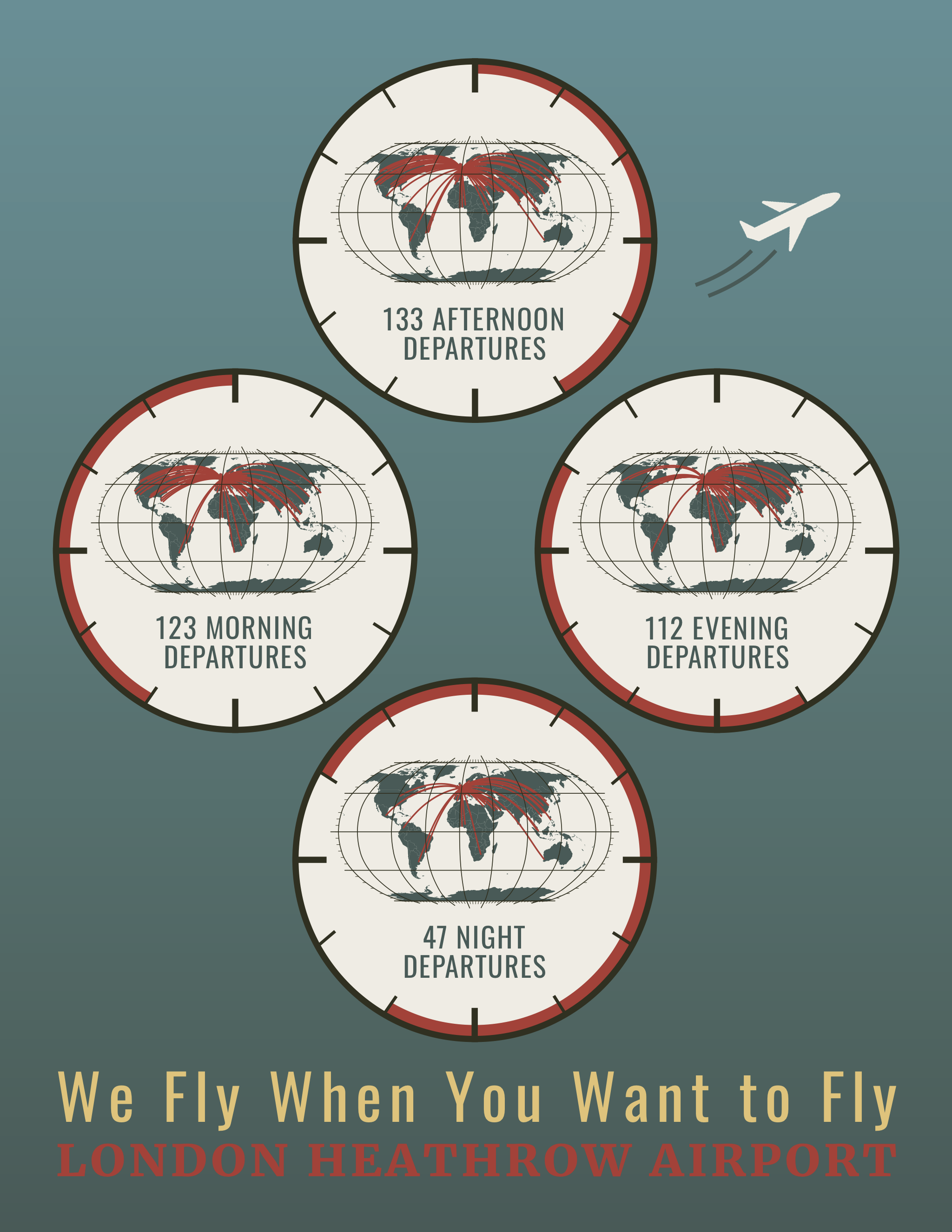
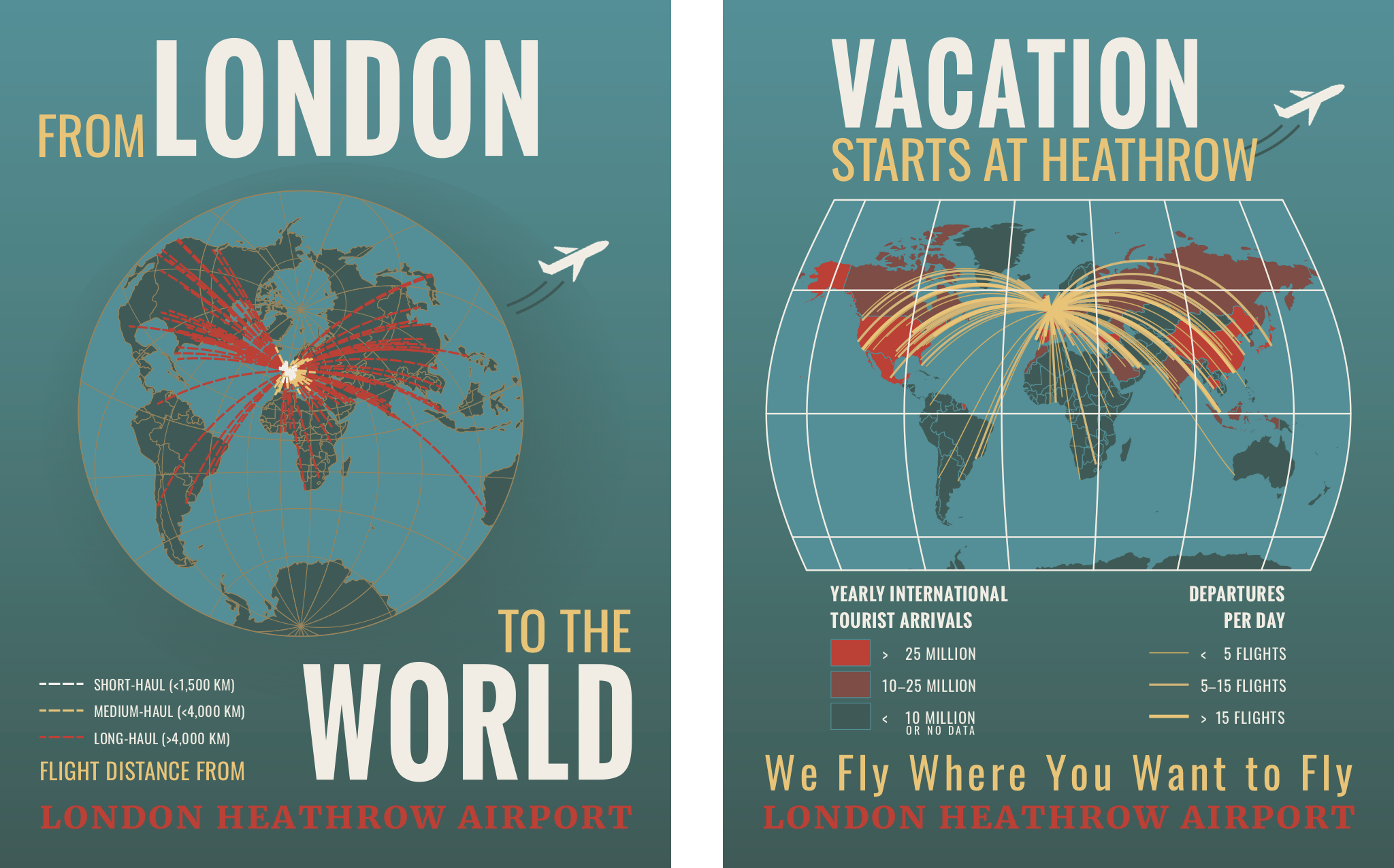
For a project in a graduate cartography course, I was tasked with creating three advertisements for London Heathrow Airport, the second busiest airport in the world for international passengers. As an exercise, we were to visualize flights departing at various times of the day (above), as well as flights by distance and flights to major tourist destinations (below). Another requirement was that we experiment with different projections as was fitting for the particular ad.
I took inspiration from vintage airline ads, and am proud of the “watch face” concept in the first ad above which had to be executed entirely in ArcGIS Pro…
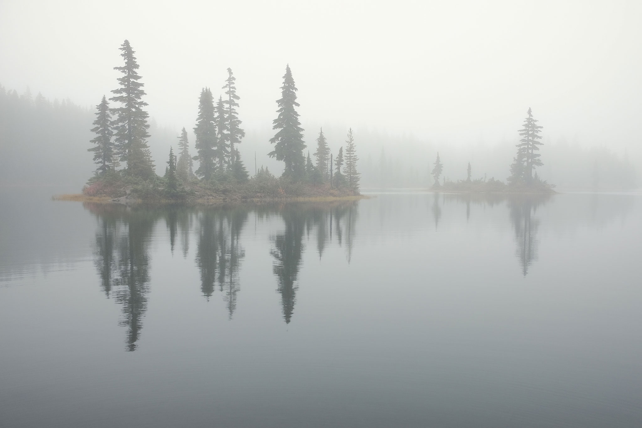
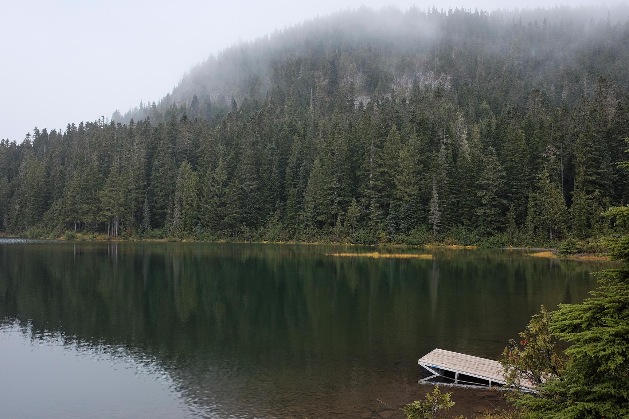
Hiking through the mist on the Forbidden Plateau in Strathcona Provincial Park, British Columbia, we came out of the forest to look over this small lake. Though this landscape may be a day’s hike from the nearest road, the sole human-made object in the photo, the dock, shifts our view of the lake, forest, and mountain such that we encounter them together as a source of recreation.
Taken with my little Fuji X70 and those beautiful Fuji jpeg colors. (Straight out of the camera plus a little straightening.)
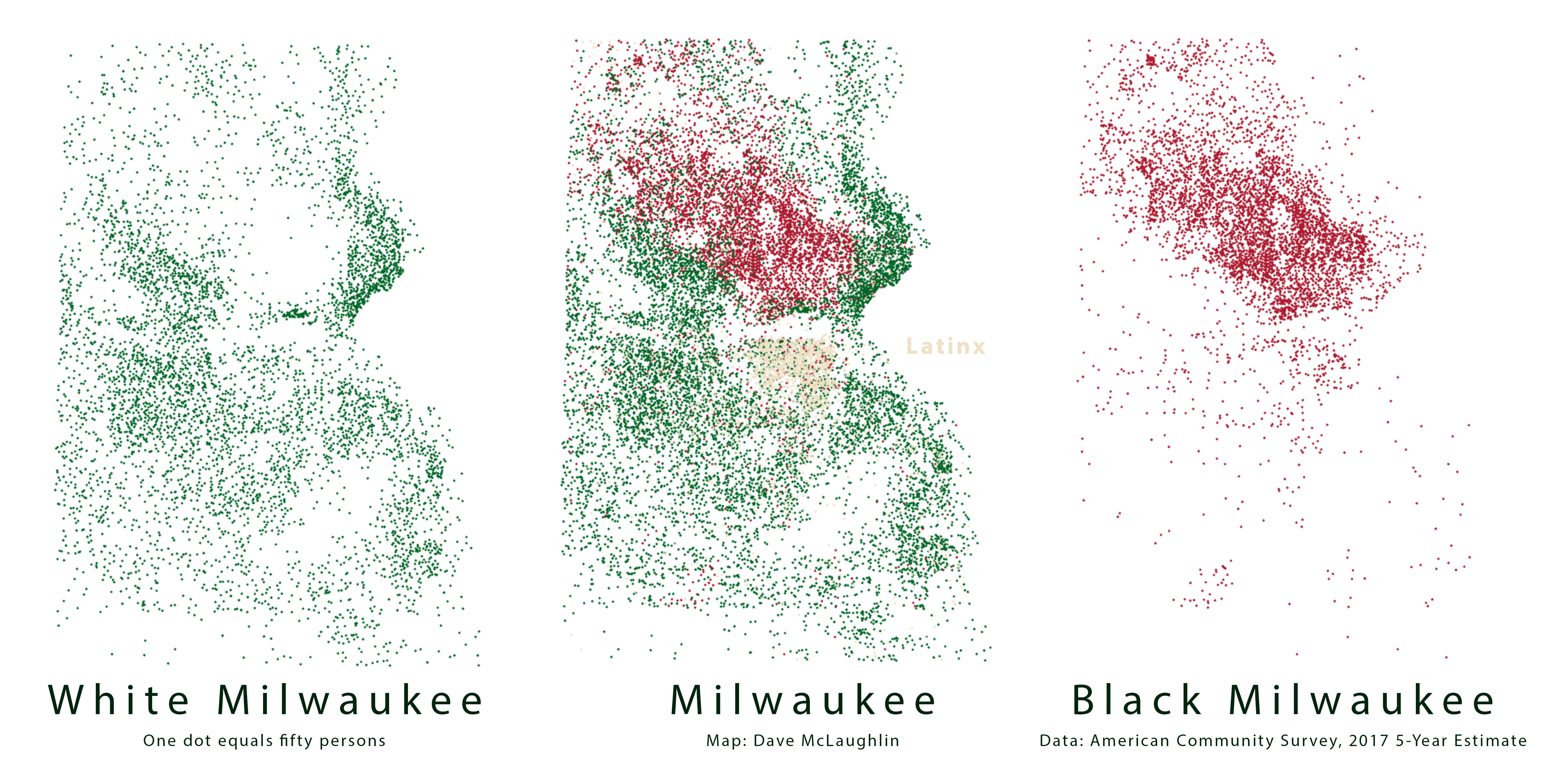
A dot density map of Milwaukee, Wisconsin, showing white, black, and Latinx residents in the Bucks’ colors. A 2018 Brookings study showed Milwaukee as having the highest black-white segregation among large American cities.
In a March interview in The Guardian, Bucks’ guard Malcolm Brogdon spoke about his experience of living in such a segregated city. The NBA team has a very public recent history confronting racism.
In 2015, center John Henson had the police called on him while attempting to buy a watch at a suburban jewelry store. Bucks president Peter Feigin called the city “the most segregated and racist place” a year later, and the organization has been outspoken in support of its players and in working on issues of racial inequity.
In early 2018, rookie Sterling Brown was apprehended for a parking violation in a Walgreens lot. “Nearly a dozen officers responded and Brown was taken to the ground and tasered in the back.” The Bucks supported Brown in his filing of a federal civil rights lawsuit against the city and its police department.
Here are nineteen years’ worth of drought maps, animated across just over a minute. Darker red-orange marks more severe drought conditions, as you might have guessed. Look at how parts of Southern California have spent essentially the last decade in drought, with few periods of relief.
I manipulated the data on the map (ArcGIS Pro) with Python and arcpy, scripting the export of each frame as a png. Then I used GMIC to smooth an extra frame in-between (“tween”) the maps, which helps the animation not feel quite as jumpy. Lastly, I compiled all of those frames into a video with FFmpeg.
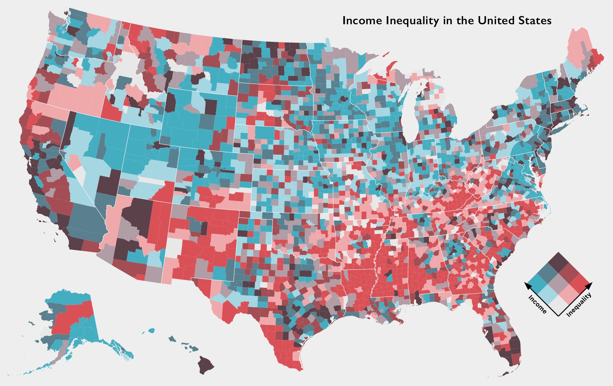
Mapping county-level median household income levels compared to income inequality (using the Gini coefficient) with American Community Survey data. This was another bit of playing around with Mike Bostock’s D3, this time with his Observable notebook on making bivariate choropleth maps.
Look at how many other flags can be found within the flag of Norway! The Nordic Cross and common red, white, and blue surely contribute: Alex Crouch at the Flag Institute has the details.
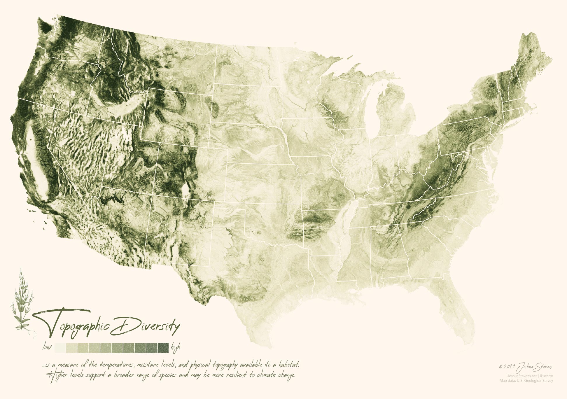
Oh my goodness, this is gorgeous! Joshua Stevens created this striking map with USGS data on topographic diversity, which is comprised of a number of types of data, not just elevation.
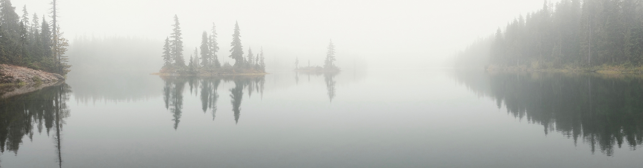
Speaking of Vancouver Island and Strathcona Provincial Park, here’s a photo from a foggy hike around the Forbidden Plateau. Surreal, magical, etc. I can still feel the mist six months later.
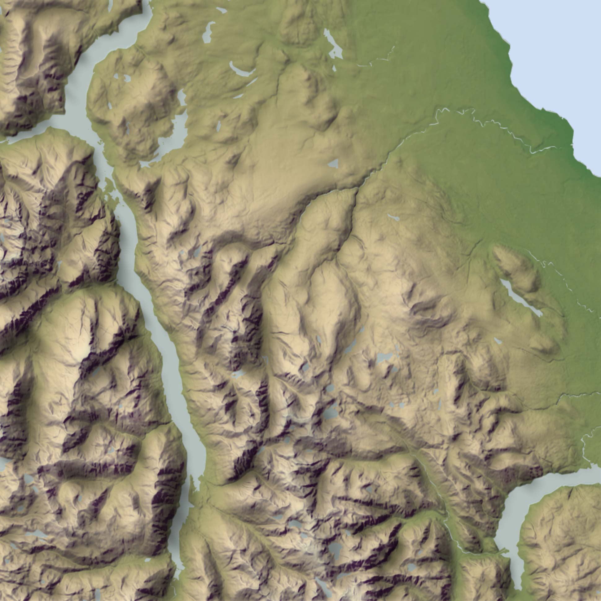
Andy Woodruff’s done some amazing stuff rendering hillshades entirely in the browser. Mess around with the various parameters and see the results in the embedded map, no Blender needed. Above is Buttle Lake and the Forbidden Plateau, in Vancouver Island’s Strathcona Provincial Park, with a little bit of a purple added to the shadows, yellow in the highlights, and a bit of a darker green in the lower elevations.
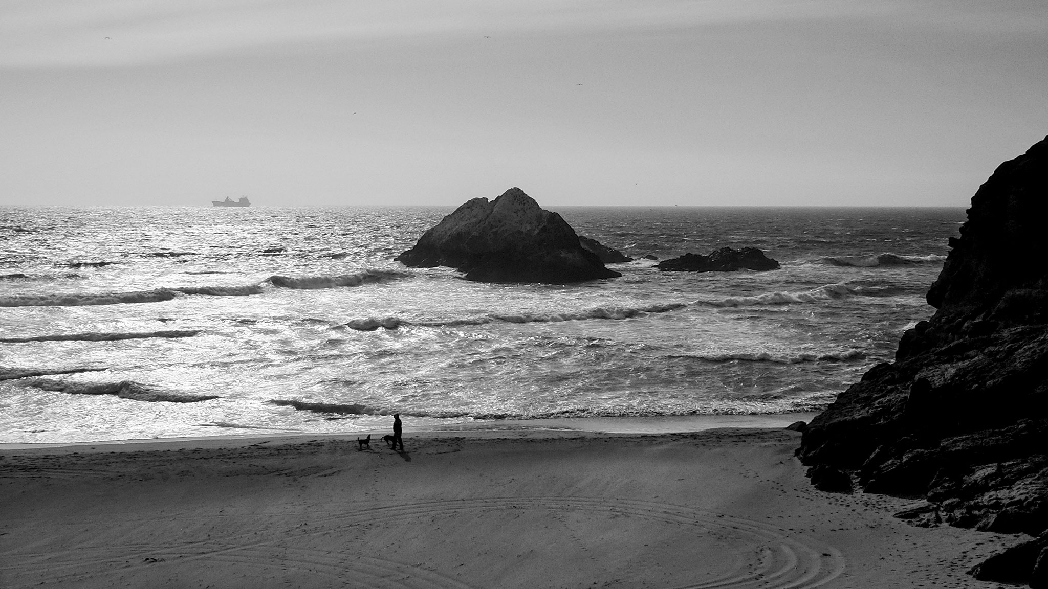
At the edge of the landscape, overlooking a San Francisco beach and Seal Rocks next to the Cliff House, with the ocean stretching beyond the horizon, we feel boundless and bounded at the same time. The ship can come no closer, the person and dogs can go no further, and the truck has had to turn around. The water occupies the same space, yet never stops moving.
Five years of golden eagle (Aquila chrysaetos) migration in one minute!
In early 2008, The The Center for Conservation Biology fitted three juvenile eagles who winter in the Mid-Atlantic with GPS trackers. I’m fascinated by the variability in how closely they follow previous years’ paths as they migrate to Maine, Quebec, and New Brunswick for the summers. The animation adds nuance to my comprehension of their movements compared to a single static map.
I manipulated the data and animated the map (ArcMap) with Python and arcpy for a project in Penn State’s GEOG 485 GIS Programming and Software Development course.
The base map is made with Natural Earth data. I overlayed the eagles locations as points, scripted the sequential exporting of each day as an image, then compiled those images into a video with FFmpeg.
Many thanks to CCB for their work and for access to the data from their Tracking Golden Eagles in Eastern North America project, where you can learn more about the birds and the impetus for studying them.
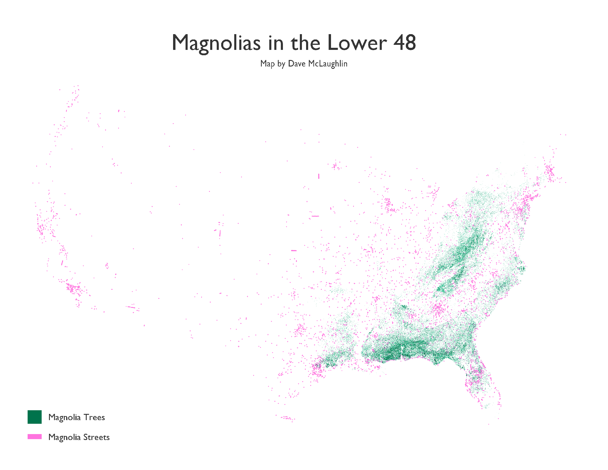
This is a rough first draft of a map showing where the US Forest Service says the various types of magnolia trees are in the US (green), along with all the streets with “Magnolia” in their name (pink), according to TIGER/Line roads data. This excludes all the “Magnolia Streets” in Puerto Rico, Hawaii, and Alaska(!), thousands of miles from the nearest (native) magnolia tree.
I’ve always loved literal road names! I live a mile or so from a White Church Rd, which is a country dirt road with a pretty little 1700’s church at the end of it…that is white. I love that! Of course things change over time. Sometimes the places change and the name no longer fits, even though it remains. Sometimes the name changes.
I saw some gorgeous tree distribution maps by Bill Rankin – they would count as inspiration, and his notes there also pointed me to the Forest Service data.
After finding my way back to Ben Fry’s All Streets map, and the musing he posted about wanting to compare street names to tree distributions since so many streets are named after trees, I was off to try to make something. He mentioned magnolias, so I started there.
I’ve thought for a while that I’d like to try to create some maps showing places (streets, towns, counties, etc.) that are named after species (plant or animal) that no longer reside there, due to habitat loss, extinction, climate change, etc. Maybe I’ll get there someday!
First priority for this map is dissolving the tree data a bit and working to make things more legible at normal sizes.
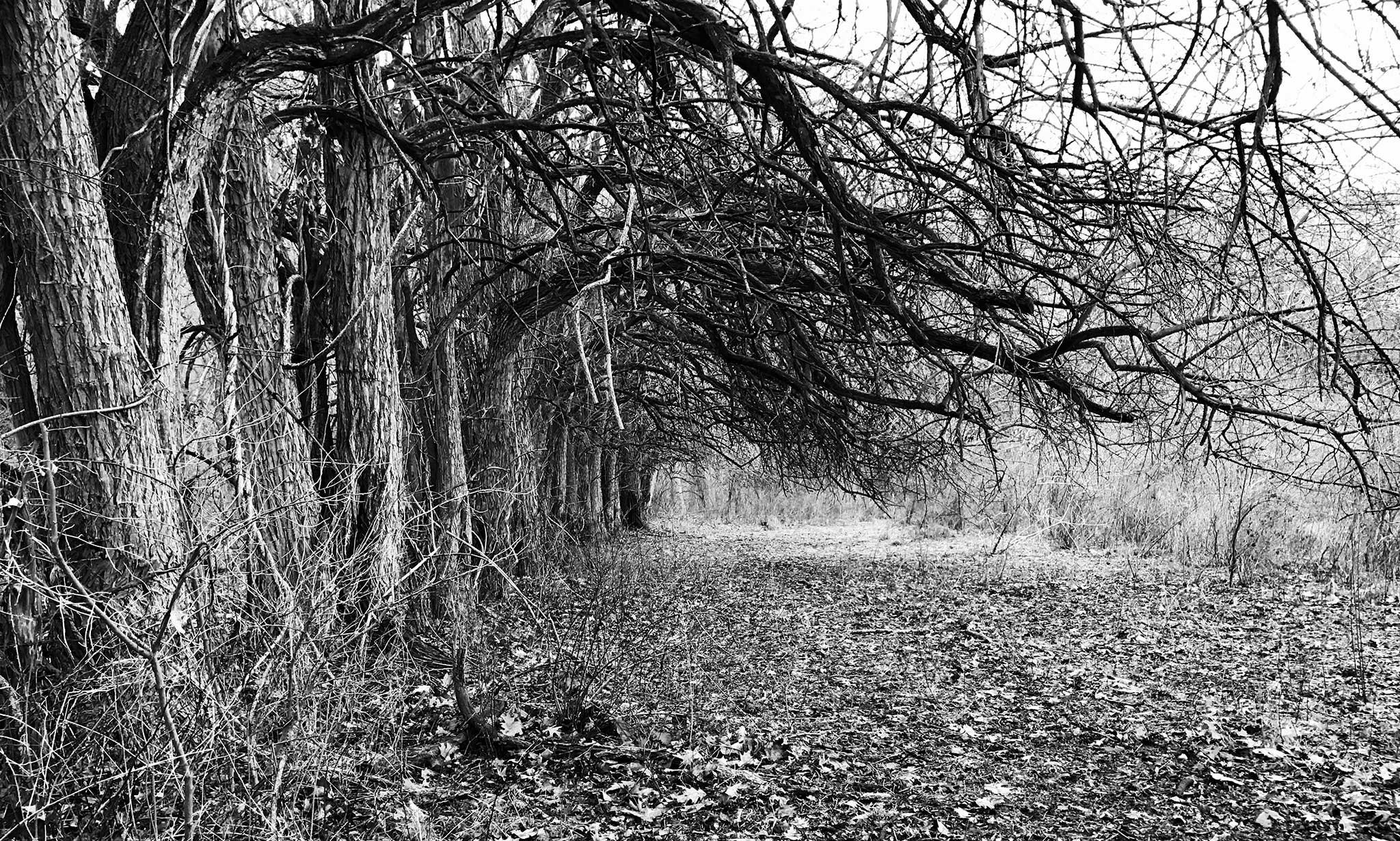
An iPhone photo of some trees lining the edge of an old field, taken one dreary winter morning a year-and-a-half ago while hiking in a local county park with my kids. I hope to get back there in more ideal light with another camera, but I post because I’m also hoping to map this park and its trails.
Many of our local parks have wonderful trails that are poorly mapped, with some lines on a blank white brochure page. With no indicators of trail scenery, terrain, difficulty, or even tree blaze color, it can make choosing a new hike with kids intimidating.
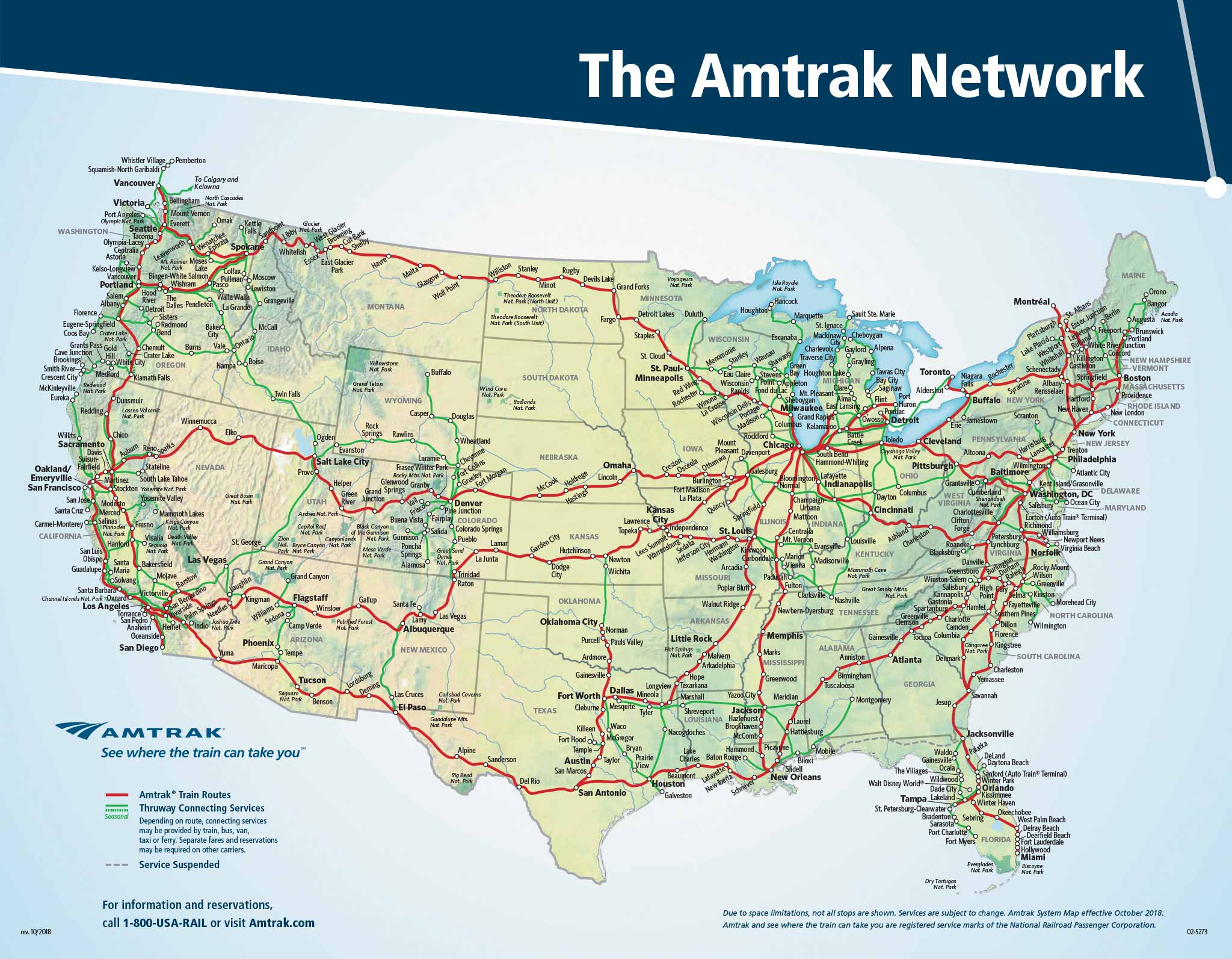
Took my son to the American Natural History Museum in New York for his sixth birthday last week, and we spent more than half the ride from Lancaster, PA to Manhattan staring at the Amtrak National Route Map, dreaming of places to go and we’d get there. Needless to say, it was a wonderful ride and some great father-son time!
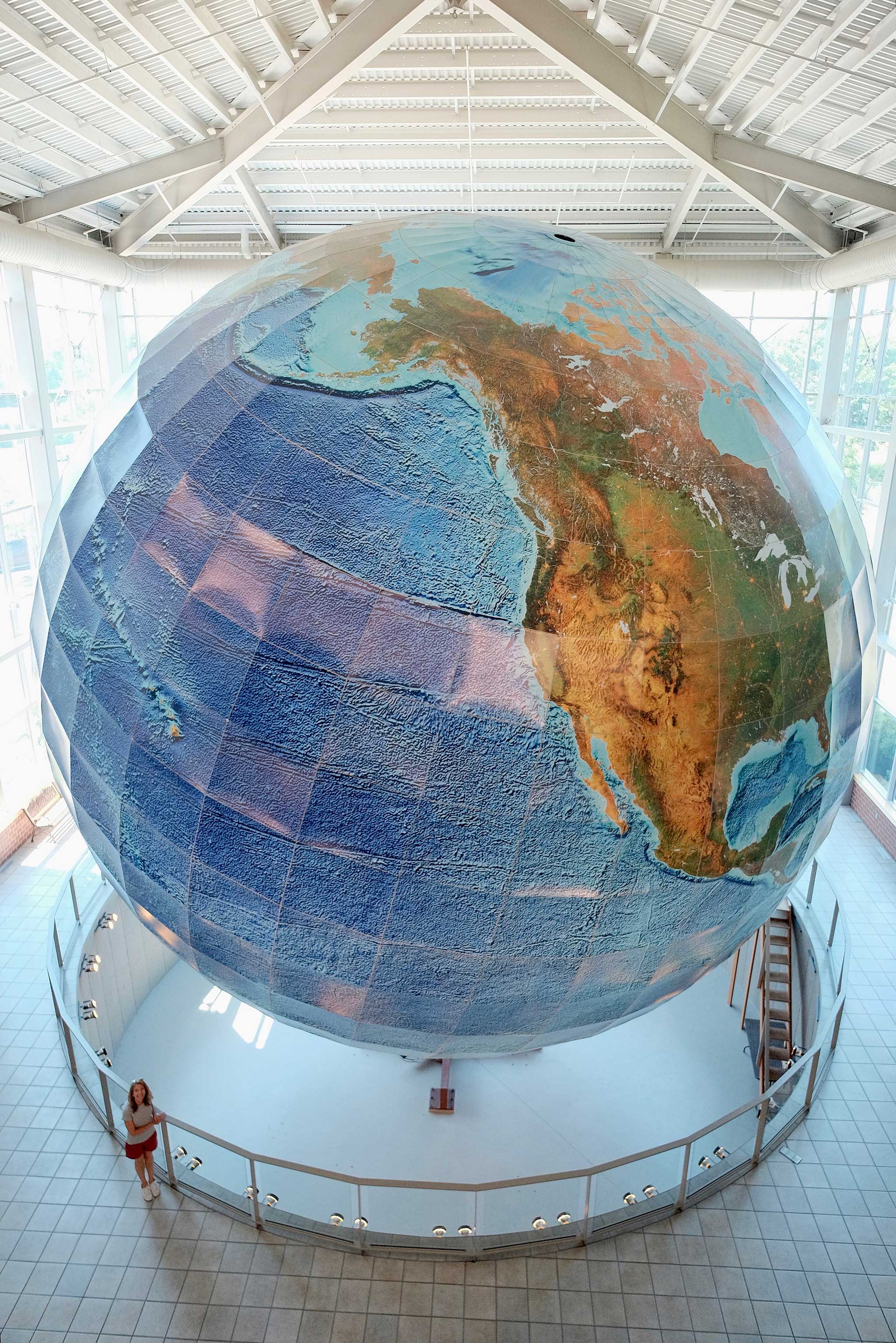
My wife and I took a 10th-anniversary trip (sans kids, thanks Mom & Dad!) to Portland, ME, and while there visited Eartha, the world’s largest rotating globe. Built at Delorme’s (now Garmin) headquarters in Yarmouth, just a few minutes north on I-295 from Portland, the globe is just over 41 feet in diameter and is printed with shaded relief and depth.
We watched from all three stories of viewing platforms for more than a day…but of course a day on Eartha (one full rotation) only takes 18 minutes.
While in Portland we also visited the Osher Map Library on the Portland campus of the University of Southern Maine. I am a lucky guy! The library has an awesome display of rare terrestrial and celestial globes, and many of them have been imaged for 3D viewing online. If you go, ask to see the displays, which are otherwise kept behind curtains to protect the globes from light.
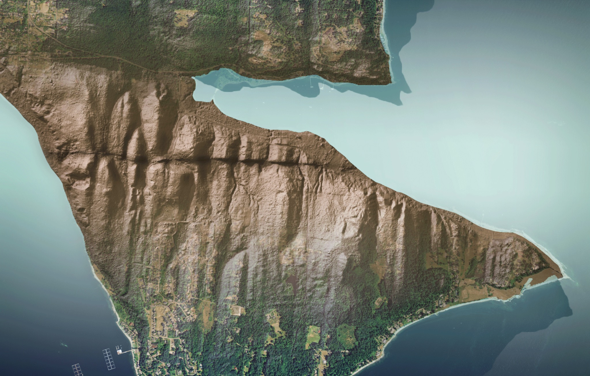
Incredible examples of LIDAR exposing geology otherwise hidden by foliage from the Washington State Geological Survey! Above is a fault scarp on Bainbridge Island.


